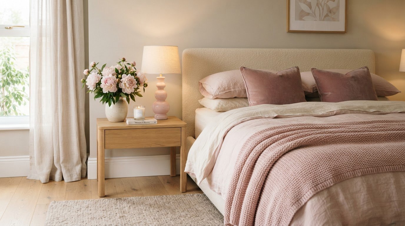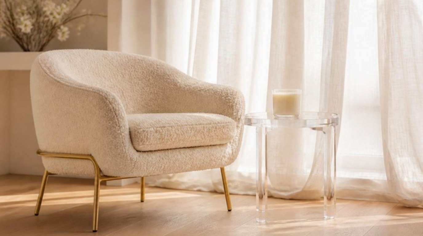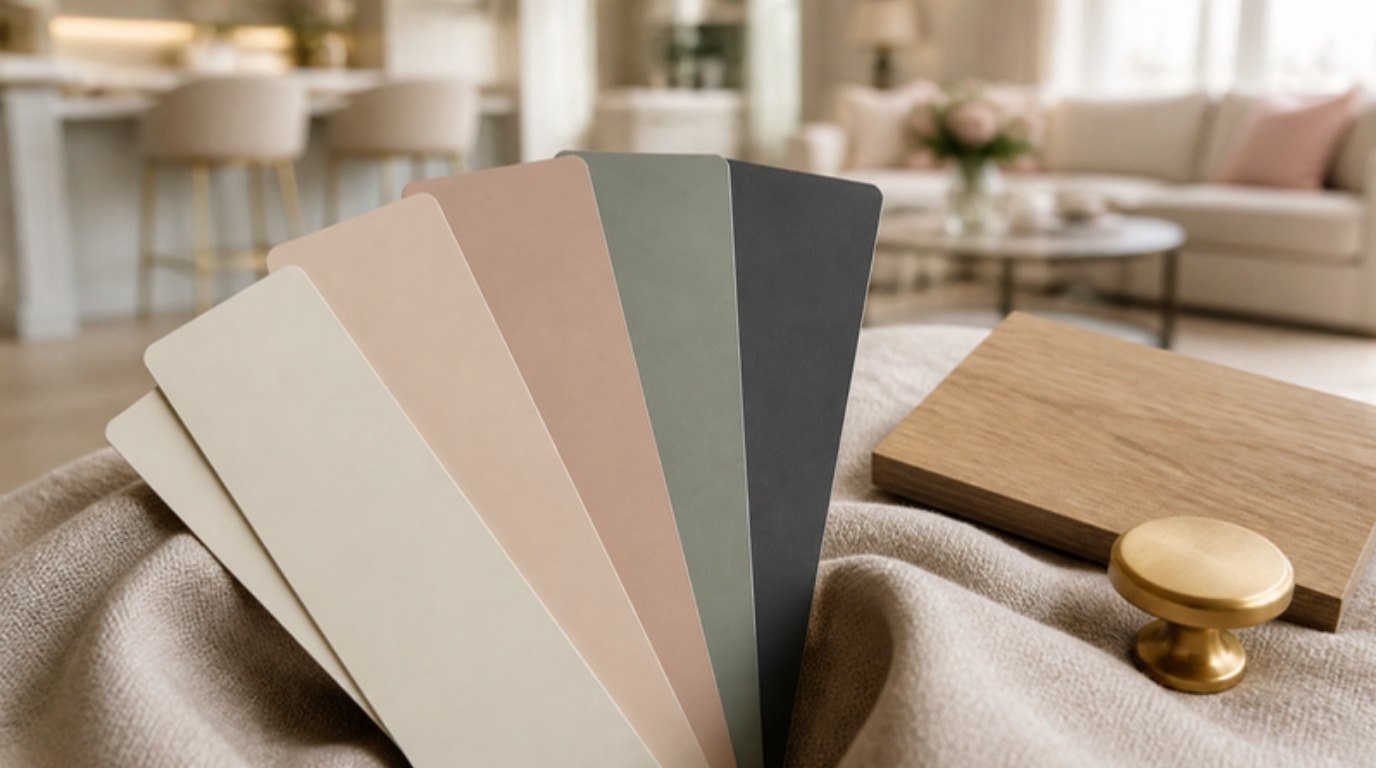
A home feels pulled together not because every room matches, but because every room seems to know the others. The colors repeat, the undertones agree, and when you walk from the hallway into the kitchen nothing jolts you. That feeling has very little to do with expensive furniture and almost everything to do with a plan.
A whole-home color palette is that plan. It's a small family of colors (usually three to five) that you repeat in different amounts from room to room, so the spaces feel connected even when each one has its own personality. The good news: you don't need a designer, and you don't need to repaint everything this weekend.
In this guide I'll walk you through where to start, how to pick your colors and their roles, why undertones matter more than the color itself, the 60-30-10 rule, how to handle trim and ceilings, how to test samples properly, four palette examples you can borrow, and a palette planner table you can fill in room by room.
What a Whole-Home Color Palette Really Means
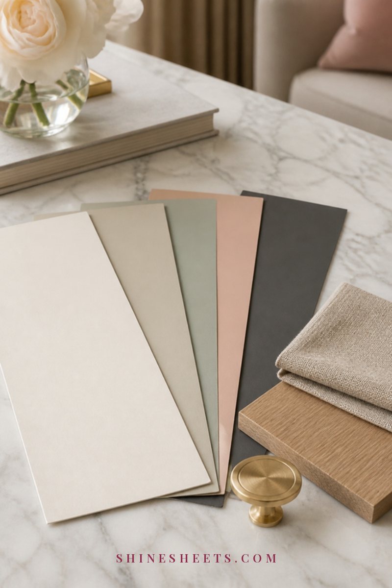
A whole-home palette is not "paint every room the same beige." It's closer to a wardrobe. You have a few base pieces you wear constantly, a couple of supporting colors and one or two accents that make things interesting. If you've ever built a wardrobe color palette, the logic is almost identical: fewer colors, chosen on purpose, that all work with each other.
In practice, that means:
- Every color in your palette can sit next to every other color without fighting.
- Each room uses the same palette, but in a different mix (a bedroom might lean on the soft secondary color, an office might use more of the deep anchor).
- Your wood tones and metals are part of the palette, not an afterthought.
- When you shop for a pillow, a rug or a lamp, you already know whether it belongs.
That last point is my favorite side effect. A palette quietly saves money, because you stop buying things that look lovely in the store and lonely at home.
Start With What You Can't Change
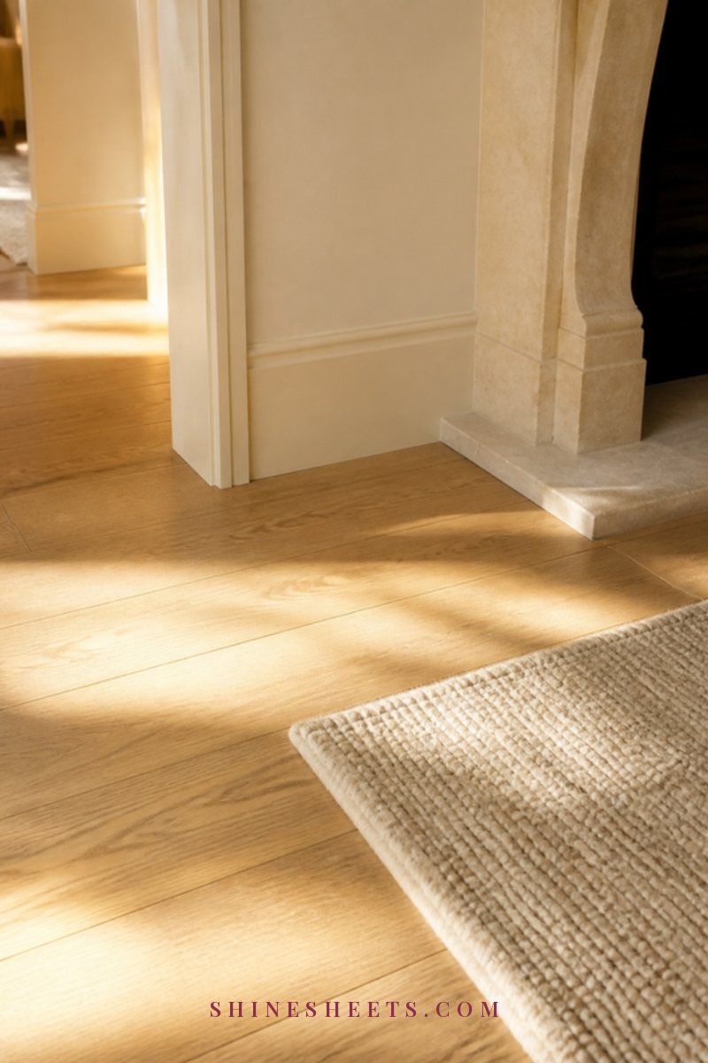
Before you look at a single paint chip, walk through your home and write down everything that is staying put. These fixed elements are the real starting point of your palette, and ignoring them is the most common reason a "perfect" color looks wrong on the wall.
Floors, Counters and Built-Ins
Look at your flooring first, because it usually runs through several rooms. Is the wood honey, orange-ish, reddish, gray-washed or nearly white? Is the tile cool gray or warm beige? Then check kitchen counters, bathroom tile, a brick or stone fireplace and any built-in cabinets you're not painting. Write each one down with a simple note: warm, cool or neutral.
A quick trick: hold a sheet of plain white printer paper against each surface. Against pure white, a "neutral" floor suddenly shows its true leaning, pink, yellow, orange or green.
The Light in Each Room
Light changes color more than anything else in your home. In general (for the northern hemisphere):
- North-facing rooms get cooler, softer light all day. Cool grays can look flat or chilly here, so warmer neutrals usually feel better.
- South-facing rooms get warm, bright light. Almost everything looks good, and very warm colors can even turn a little yellow.
- East-facing rooms are warm and bright in the morning, cooler in the afternoon.
- West-facing rooms are cooler in the morning and glow warm and golden in the evening.
Your bulbs matter too. Warm white bulbs (around 2700K) pull everything warmer, while cooler daylight bulbs make walls look bluer. If you want help choosing bulbs and lamps that flatter your colors, my guide to lighting ideas for every room goes deeper.
Choose 3 to 5 Colors: The Palette Formula
Here's the formula I'd recommend for almost any home. Each color gets a job, and once each job is filled, you stop adding. Five roles, no more:
- The main neutral. This is the color you'll see most: hallways, living spaces, maybe most walls in the house. A warm white, soft cream, light greige or gentle beige works for most homes. Choose it first and choose it carefully.
- The secondary color. A deeper or softer relative of your main neutral, or a quiet color like muted sage, dusty blush or pale blue-gray. This goes on a bedroom, a dining room or kitchen cabinets.
- The accent. A richer color used in small doses: an inside of a bookcase, a front door, a powder room, pillows and art. Think terracotta, deep green, navy or a warm caramel.
- The deep anchor. Something dark that grounds everything: charcoal, soft black, chocolate brown or ink blue. It can show up in window frames, a lamp base, picture frames or a single cabinet.
- Wood and metal. Choose one main wood tone (light oak, walnut, honey pine) and one or two metals (brushed gold, black, nickel). These count as colors, so treat them that way.
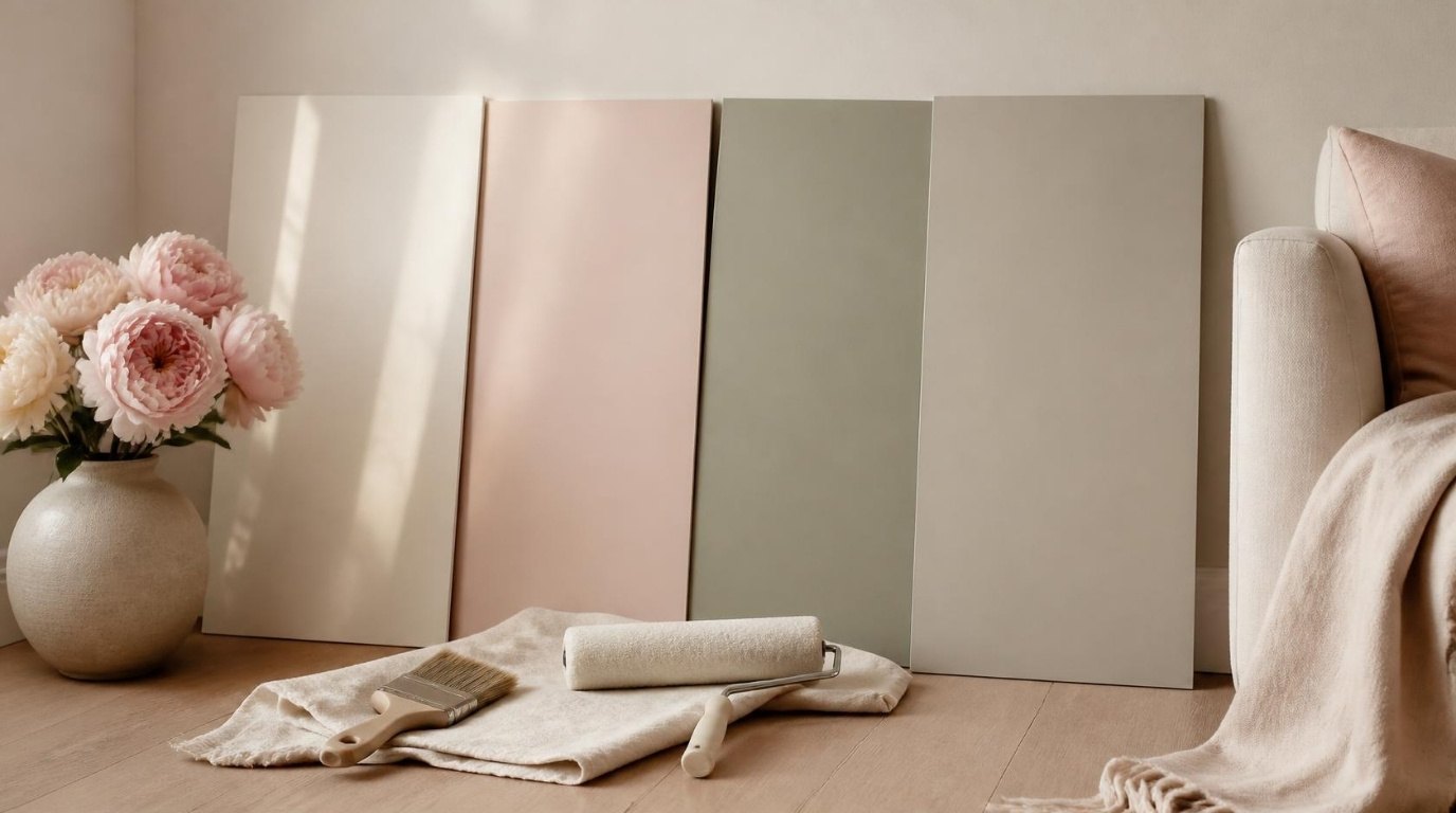
A paint color fan deck is genuinely useful at this stage. Instead of tiny chips scattered across the table, you can see a whole family of related colors from light to dark, which makes picking your main neutral and its deeper "sibling" much easier.
If you're unsure where to begin, my step-by-step guide on how to choose paint colors covers the single-room decision in more detail. This article is about making all those single decisions fit together.
Undertones: The Secret Behind Rooms That Flow
If there's one concept that makes or breaks a whole-home palette, it's undertone. Two beiges can look identical on a chip and completely different on a wall, because one leans pink and the other leans green.
Every neutral has a hidden leaning:
- Warm undertones: yellow, red, pink, peach. They feel welcoming and soft.
- Cool undertones: blue, green, violet. They feel crisp, calm and fresh.
- Balanced undertones: neutral greiges that sit in the middle and play well with both.
The rule for flow is simple: keep your undertones in the same family. A warm cream main neutral pairs beautifully with a warm blush secondary and a terracotta accent. Put a blue-leaning gray in the next room, and the cream suddenly looks yellow and the gray looks cold. Neither color is wrong. They just don't belong to the same family.
To find an undertone, compare. Line up several "whites" or "beiges" side by side, and the differences jump out. The color that looks pinker than the rest leans warm-pink, the one that looks greener leans cool-green. Then check it against your fixed elements from the first step. Orange-toned wood floors, for example, love warm creams and can make cool grays look slightly purple.
The 60-30-10 Rule, Room by Room
The 60-30-10 rule is an old decorating guideline that still works because it's so easy to follow. In any one room:
- 60% is your dominant color (usually walls, large rugs, maybe a big sofa).
- 30% is your secondary color (curtains, an accent wall, bedding, a few larger furniture pieces).
- 10% is your accent (pillows, art, a vase, a lamp, small decor).
The magic for a whole home happens when you shift the proportions from room to room while keeping the same colors. Your living room might be 60% main neutral, 30% wood and secondary, 10% terracotta. Your bedroom might flip it: 60% soft blush, 30% main neutral in bedding and trim, 10% deep anchor in frames and a lamp base. The rooms feel different, but clearly related.
Don't treat the numbers as math homework. Think of it as "mostly, some, a little." If you can name which color is your "mostly" in each room, you're already doing it right.
How To Make Color Flow Between Connected Rooms
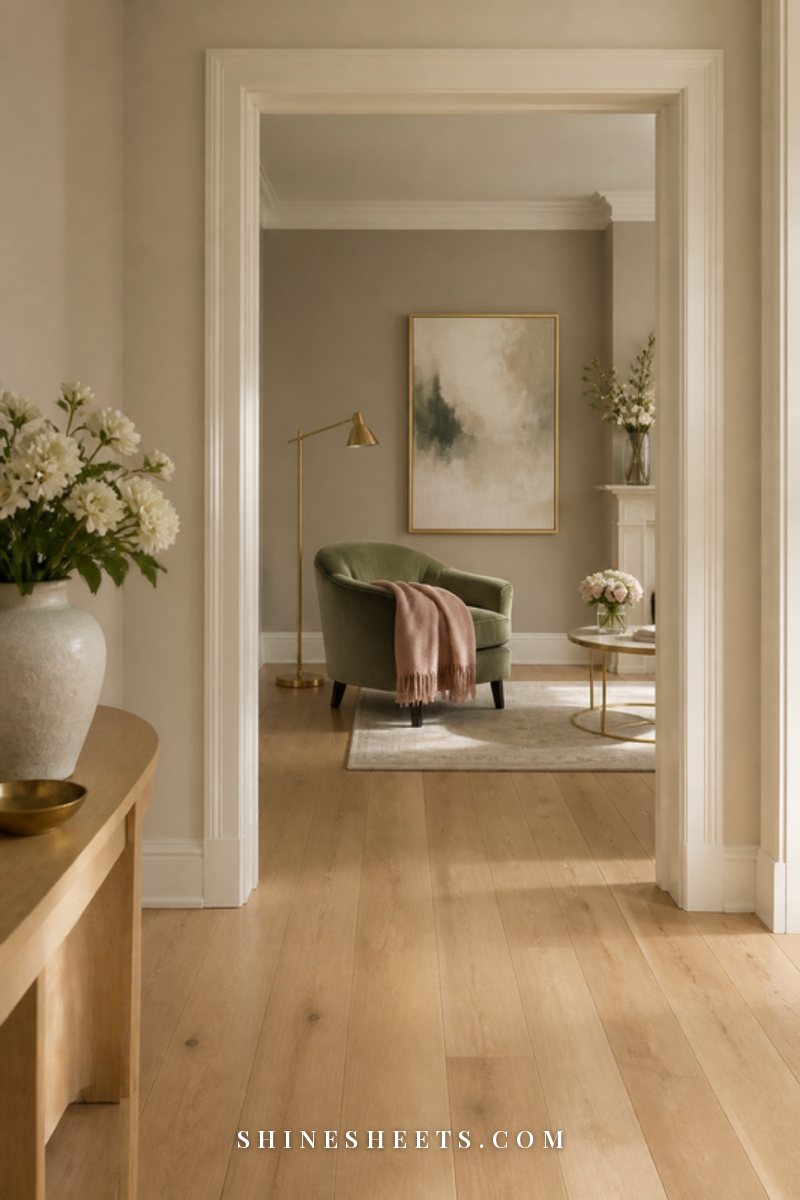
The rooms that matter most for flow are the ones you can see from each other. Stand in your entryway and look around. Everything visible from that spot should feel like it belongs to the same palette. Bedrooms and bathrooms behind closed doors can be a little more independent.
Use Your Main Neutral as the Thread
Hallways, stairwells and landings are the connective tissue of a home. Painting them in your main neutral gives every room off them a calm, shared backdrop. It also means you can take more risks inside individual rooms, because the hallway resets the eye between them.
Shift by One Step, Not Five
When two rooms open into each other, choose colors that are close relatives. A favorite designer trick: use the same color strip and go one or two shades deeper in the next room. The rooms read as one family with a gentle change of mood, and the transition never feels abrupt.
Repeat Something in Every Room
Color flow isn't only about walls. Repeat your accent color in at least two connected rooms, even in small ways: a terracotta pillow in the living room and a terracotta vase on the kitchen shelf. Repeat your metal (brushed gold cabinet pulls, a gold-framed print, a gold lamp). Your eye picks up those echoes and links the spaces together without you having to explain anything.
Open-Plan Spaces
In an open kitchen, dining and living area, keep walls in one color and create "zones" with everything else: a rug in your secondary color under the dining table, deeper-toned cabinets in the kitchen, accent pillows on the sofa. If you want to separate areas with paint, choose a natural break, like an inside corner or the edge of a column, rather than stopping in the middle of a flat wall.
Trim, Ceilings and Doors
Trim and ceilings are where palettes quietly fall apart, because they get chosen last and in a hurry. A little thought here makes everything look more expensive.
- One trim color for the whole house. Choosing a single trim color (usually a soft white that matches the undertone of your main neutral) is the simplest way to make a home feel consistent. A stark, blue-white trim next to warm cream walls looks harsh, so match warm with warm.
- Ceilings slightly lighter than walls. A ceiling in a very light version of your wall color, or the trim white, feels softer than plain flat white. In low rooms, painting walls and ceiling the same pale color can make the room feel taller.
- Color-drenching for small rooms. In a powder room, office or nook, painting walls, trim and ceiling all in one color (often your secondary or accent) feels intentional and enveloping.
- Interior doors as a design choice. Doors can match the trim, or you can paint them in your deep anchor for a classic, tailored look. Whatever you pick, keep it consistent along a hallway.
For paint finishes, a common, practical mix is matte or eggshell on walls, flat on ceilings and satin or semi-gloss on trim and doors, since they get touched the most.
How To Test Paint Samples Before You Commit
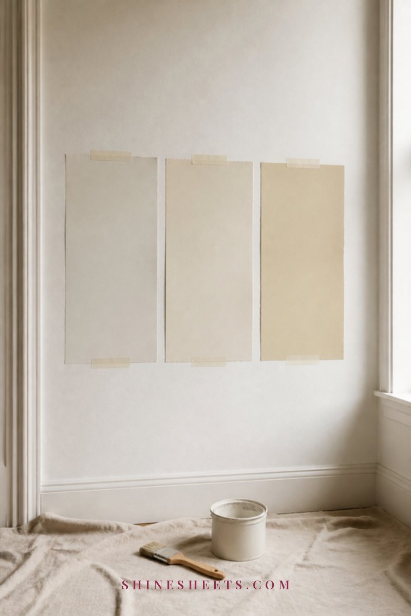
I'll be honest with you: skipping this step is how good palettes end up as expensive repaints. A color can look perfect on a tiny chip and completely different on a large wall in your own light. Testing takes a few days, and it's worth every one of them.
- Go big. Test at least a sheet-of-paper size, ideally larger. Peel-and-stick paint sample sheets are a clean option for renters or anyone who doesn't want patchy test squares on the wall. You can also paint large pieces of white poster board with sample pots.
- Use a white border. Keep a margin of white around each sample, so your current wall color doesn't influence how you see it.
- Test in every room the color will go. Your main neutral should be tested in the hallway, the north-facing bedroom and the sunny living room, because it'll look different in each.
- Look at different times of day. Check in the morning, mid-afternoon, evening and under lamplight. Leave samples up for at least two or three days.
- Test against the fixed elements. Hold samples right next to the floor, the counters and the fireplace. That's where undertone clashes show up.
- Test next to its neighbors. Place your main neutral and secondary color samples side by side near a doorway, so you can see the transition.
When you're ready to paint, a few basics make the result cleaner. A set of angled paint brushes helps with cutting in around trim, and good painter's tape gives you crisp lines between walls and ceilings (press the edge down firmly and pull it while the paint is still slightly wet).
4 Whole-Home Palette Examples To Borrow
These are starting points, not rules. Each one lists the roles from the palette formula, so you can swap any color for a close cousin that suits your floors and light. I'm describing colors, not brand names, so you can find versions you like in any paint line.
The Warm Neutral Palette
- Main neutral: soft warm white with a hint of yellow
- Secondary: light mushroom greige
- Accent: caramel or warm terracotta
- Deep anchor: chocolate brown
- Wood and metal: honey or medium oak, brushed brass
This one is calm, welcoming and very forgiving, especially with orange-toned wood floors or a lot of north light. If you love that quiet, layered look, my guide to neutral home decor has many ideas for adding texture so it never looks flat.
The Soft Blush Palette
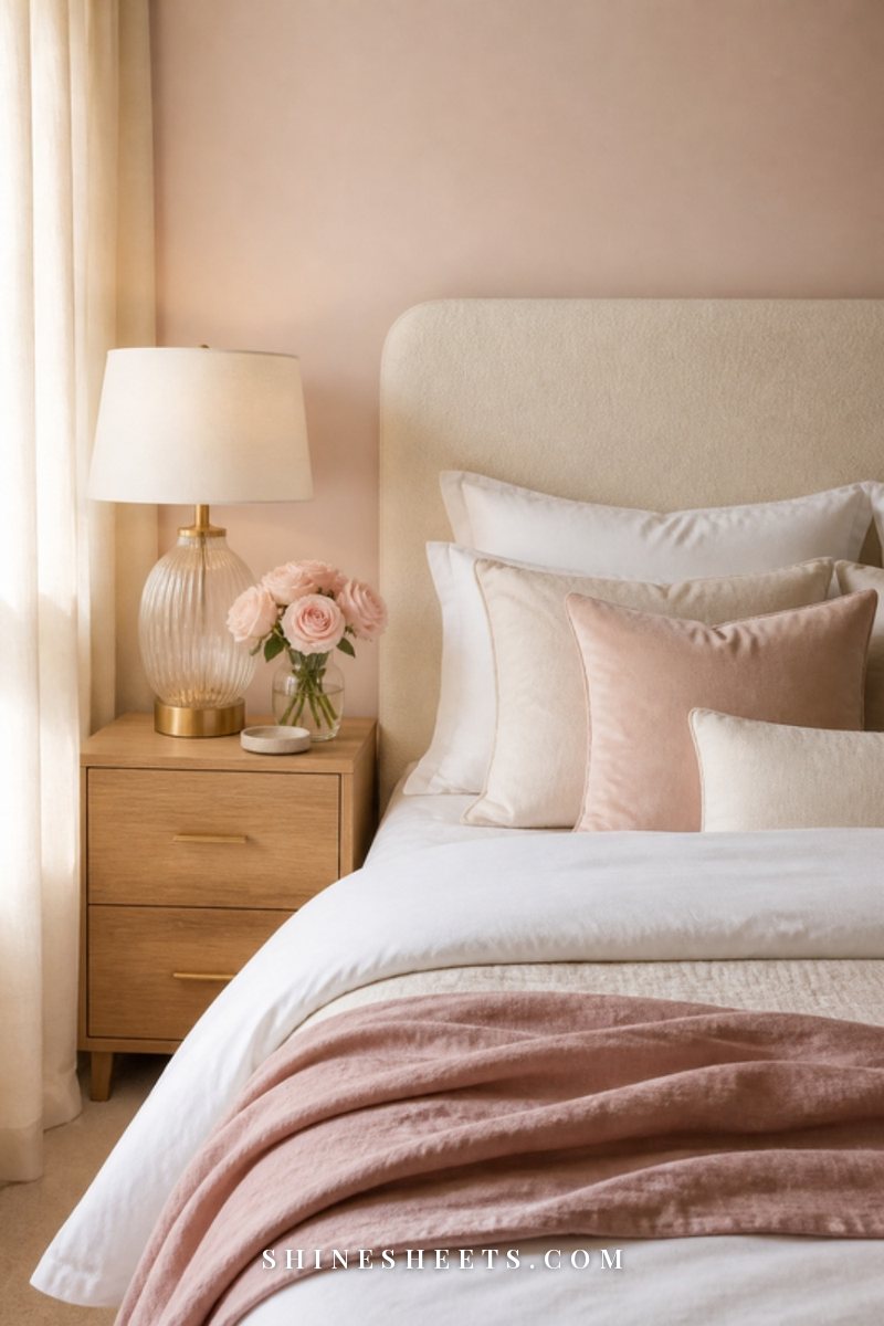
- Main neutral: creamy ivory
- Secondary: very pale, dusty blush (more plaster than candy pink)
- Accent: deeper rose or muted clay
- Deep anchor: warm charcoal
- Wood and metal: light oak, brushed gold
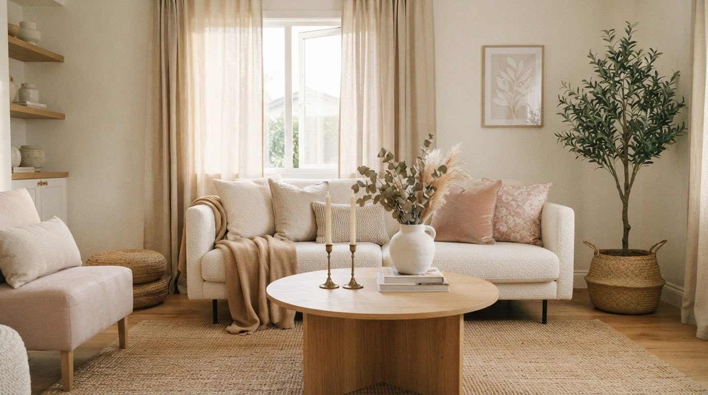
Romantic without feeling sugary. The blush works best in bedrooms, a dressing area or a dining room, while the ivory carries hallways and living spaces. Keep the blush dusty and slightly grayed so it reads grown-up.
The Sage Calm Palette
- Main neutral: warm off-white with a slight green leaning
- Secondary: muted sage
- Accent: soft olive or deep forest green
- Deep anchor: soft black
- Wood and metal: natural light wood, aged brass
Fresh, quiet and nature-inspired. Sage is lovely on kitchen cabinets, in a bathroom or a home office. It gets along with both warm and cool fixed elements, which makes it a good choice if your floors and counters disagree with each other.
The Classic Cream and Black Palette
- Main neutral: rich cream
- Secondary: warm stone beige
- Accent: camel or cognac (mostly through leather and fabrics)
- Deep anchor: soft black
- Wood and metal: dark walnut, black and polished brass
Timeless and a little Old Hollywood, which is probably why I love it. Black shows up in window frames, interior doors, picture frames and lamp shades, while cream keeps everything soft. The key is to use black in small, deliberate lines rather than big blocks.
Your Whole-Home Palette Planner
This is the part that turns a nice idea into a plan you can actually follow. Fill in one row for every room. Seeing your whole home in one table makes clashes obvious before you buy a single can of paint. Here's an example using the Warm Neutral Palette (screenshot it and replace my colors with yours):
| Room | Walls | Trim and Ceiling | Accent | Metals and Wood |
|---|---|---|---|---|
| Entryway and hallway | Main neutral (warm white) | House trim white, ceiling trim white | Terracotta runner or vase | Brushed brass hooks, oak bench |
| Living room | Main neutral | House trim white | Caramel pillows, terracotta art | Brass lamp, oak coffee table |
| Kitchen | Main neutral | House trim white | Greige lower cabinets | Brass pulls, oak shelves |
| Dining room | Secondary (mushroom greige) | House trim white, ceiling one shade lighter than walls | Chocolate brown frames | Brass candle holders, oak table |
| Main bedroom | Secondary, one step lighter | House trim white | Caramel throw | Brass bedside lamps, oak nightstands |
| Bathroom | Main neutral | House trim white | Terracotta towels | Brushed brass fixtures |
| Home office or nook | Accent, color-drenched | Same as walls | Chocolate brown shelf | Brass desk lamp, oak desk |
Once your table is done, read down each column. The trim column should be nearly identical. The metals column should repeat the same one or two finishes. The accent column should show your accent color at least twice in rooms that connect. If a row looks like it belongs to a different house, that's the room to rethink.
Bringing the Palette Into Fabrics and Decor
Paint is only half the story. Textiles and decor are where your palette becomes livable, and they're much easier to change.
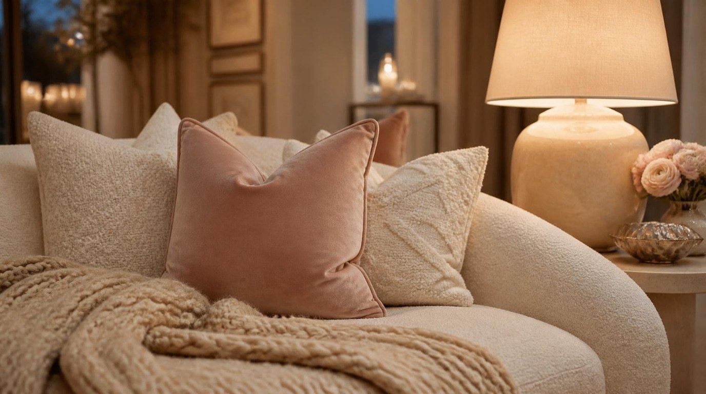
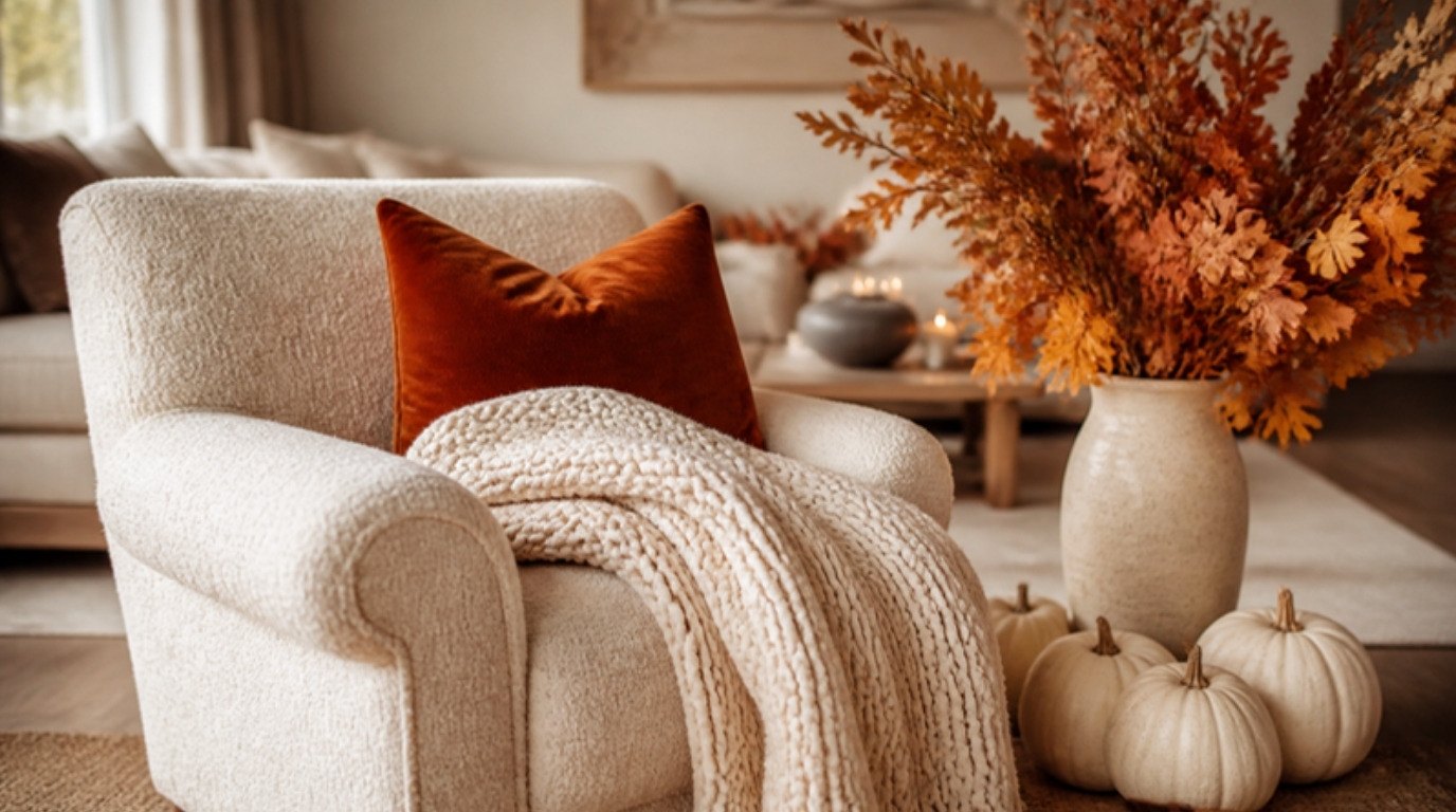
- Pillows and throws: the easiest place for your accent color. Linen pillow covers in cream work as a neutral base in every palette above, and you can mix in one or two accent covers per room. My guide to throw pillow combinations shows how to mix sizes and textures so it looks layered, not random.
- Rugs: a great place for your secondary color, especially in open-plan spaces where a rug defines a zone.
- Curtains: usually best in your main neutral or a lighter version of it, so they blend with the walls and let the light do the work.
- Art and frames: repeat your deep anchor in frames, and let art carry small hits of your accent.
- Small decor: vases, trays, candles and books are your 10%. Edit them with the palette in mind, and the rooms will feel calmer immediately.
Keep a small "palette card" on your phone: a photo of your paint samples side by side with a fabric swatch and a picture of your floor. When you're shopping and unsure, you can check it in seconds.
5 Whole-Home Color Mistakes To Avoid
- Choosing paint before fixed elements. Your floors, counters and fireplace were there first. Let them lead.
- Too many colors. If your palette has eight colors, it isn't a palette anymore. Keep it to three to five, plus wood and metal.
- Mixing undertones. A pink-beige next to a green-gray can make both look dirty. Stay in one family.
- Different whites everywhere. Four slightly different trim whites across the house make each one look a little "off." Pick one.
- Testing tiny chips under store lights. Always test large samples at home, in your light, over a few days.
For more pitfalls beyond paint (furniture scale, rugs, art height), my sister guide to common home decor mistakes is worth a look before your next big purchase.
Final Thoughts
A whole-home color palette is really just a few kind decisions made in advance: what stays, which colors belong, which undertone family you're in and where each color lives. Once those are made, every room gets easier, and so does every little purchase that follows.
Start with your hallway and your main neutral, fill in your palette planner one room at a time and let the house come together slowly. A home that flows doesn't have to be finished all at once. It just has to keep speaking the same soft language, room after room.