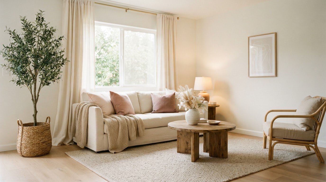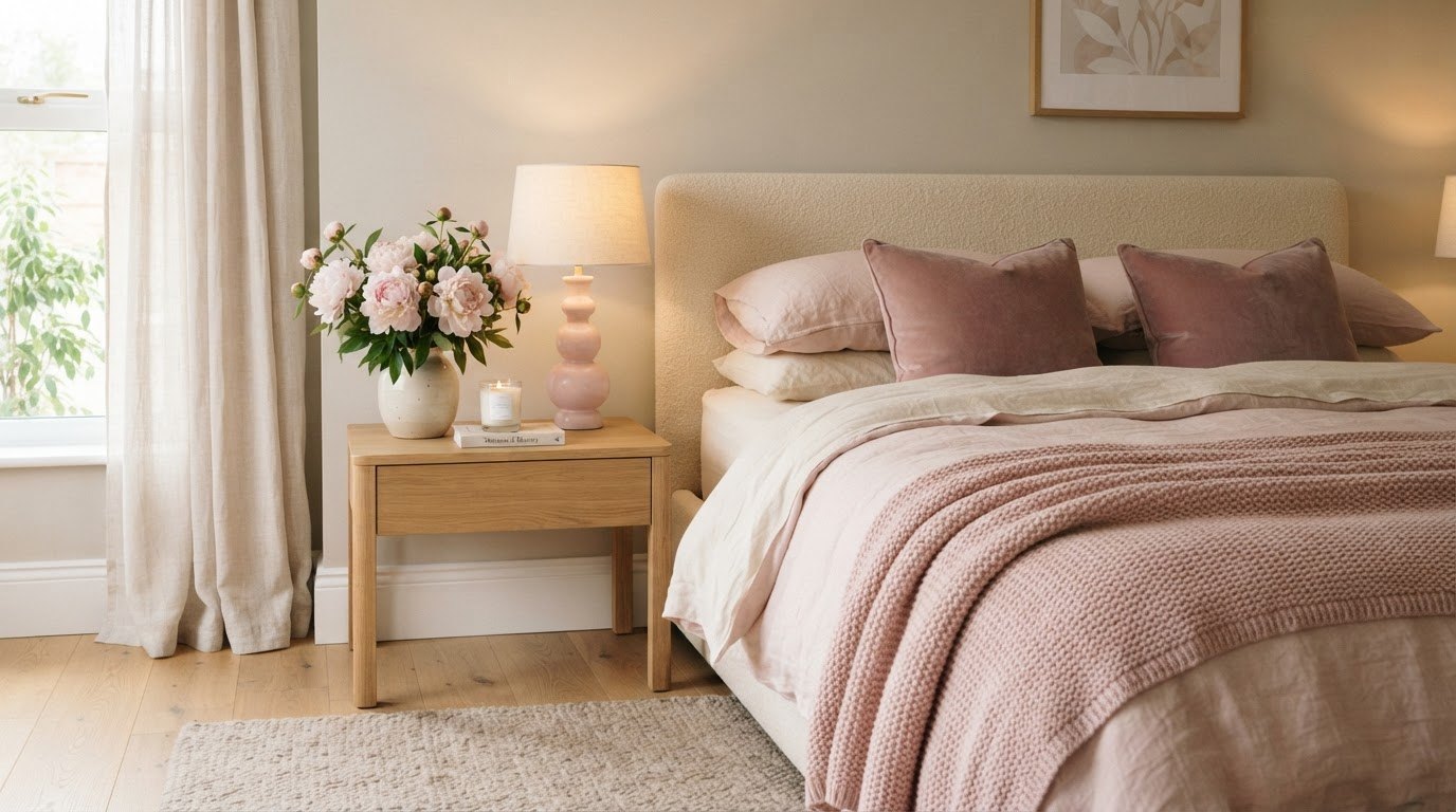
Pink looks grown-up the moment it stops being the only idea in the room. A blush wall next to warm wood, a dusty rose throw on a linen sofa, one soft pink lamp beside a stack of books – that version feels calm and considered rather than like a teenage bedroom. The color is rarely the problem. The proportions are.
This guide gathers 25 pink room decor ideas grouped into walls, textiles, furniture and accents, lighting and styling, and nearly all of them are renter-friendly. You'll also find a pink palette pairings table (which shade goes with what, where to use it and in what ratio) plus a short rules card for keeping pink soft without tipping into childish.
It took me a while to understand that I didn't really want "a pink room." I wanted a room that felt gentle. Pink just happens to be very good at that job.
Why Pink Works (and Where It Goes Wrong)
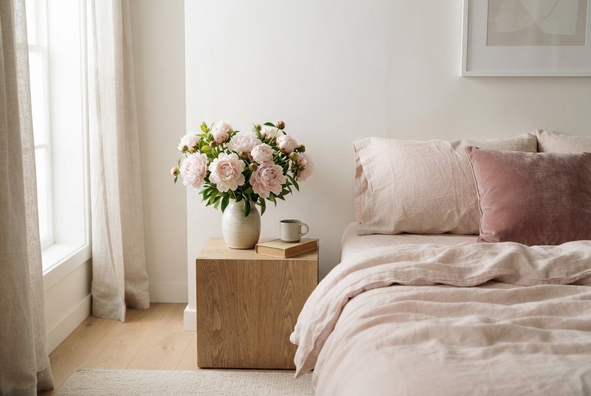
Pink is a warm color with a quiet temperament. Softer shades bounce light around, flatter skin tones in photos and make a room feel lived-in rather than sterile. That's why blush walls became a design favorite: they read almost neutral in daylight and turn rosy and warm in the evening.
Where it goes wrong is usually one of three things:
- Too much of one shade. Pink walls, pink bedding, pink rug and pink curtains in the exact same tone flatten everything. The room loses depth.
- Too many shiny, cute things. Glitter, plastic, heart shapes and slogans all at once push the space younger than you are.
- No anchor. Without something solid and grounding (wood, stone, linen, a darker shade), pink floats. It needs weight to look intentional.
The fix isn't less pink. It's smarter pink: two or three shades, a supporting color, a lot of texture and one or two materials that feel mature. The table below makes that easy.
Pink Palette Pairings Table
Pick one row and stick to it for the whole room. The ratio column tells you roughly how much of each color to use, so you never have to guess. (Screenshot it before you head to the store.)
| Pairing | Mood | Where it works best | Ratio |
|---|---|---|---|
| Blush + cream | Soft, airy, calm | Bedrooms, small rooms, north-facing spaces | 60% cream, 30% blush, 10% wood or brass |
| Rose + sage | Fresh, garden-like, restful | Living rooms, reading corners, bathrooms | 60% warm white, 30% rose, 10% sage |
| Pink + gold | Glamorous, a little Old Hollywood | Vanity corners, entryways, dressing areas | 60% pale pink, 30% white, 10% gold |
| Dusty pink + gray | Sophisticated, quiet, modern | Home offices, living rooms, shared spaces | 60% light gray, 30% dusty pink, 10% charcoal or black |
| Pink + white oak | Warm, natural, Scandinavian | Any room with wood floors or furniture | 60% white or oat, 30% pink, 10% oak |
If you're torn, start with blush and cream. It's the most forgiving pairing, it works in tiny spaces and it's easy to shift later by swapping a few accessories.
Pink Without Looking Childish: The 3-Rule Card
These three rules are the difference between "dreamy and grown-up" and "slumber party." Keep them in mind with every purchase.
- Rule 1: Follow 60/30/10. Sixty percent of the room is a calm base (cream, white, oat, light gray), thirty percent is your pink, and ten percent is an accent that adds contrast (gold, sage, charcoal, wood). Pink at thirty percent looks chosen. Pink at ninety percent looks like a theme.
- Rule 2: Mix at least three textures. Velvet, linen and a nubby knit in pink look rich together. Flat cotton in the same pink everywhere looks like a set from a bag. Think soft, matte and one with a little sheen.
- Rule 3: Add one grown-up material. Marble, travertine, brass, solid wood, ceramic or linen. One substantial material tells the eye this room belongs to an adult with taste, not a phase.
Bonus rule I keep coming back to: skip anything with words on it. A pink room with a "dream big" sign instantly looks younger. Let the colors and textures do the talking.
Pink Walls and Backdrops
Walls set the tone for everything else, but you don't need a full repaint (or your landlord's permission) to get there.
1. Try a Pink Accent Wall Behind the Bed or Sofa
One wall is plenty. Behind the headboard or sofa is ideal because it frames the main piece of furniture and leaves the other walls light. Choose a blush with a little gray or beige in it; pure candy pink tends to look loud once it covers a whole wall. If you rent, ask about painting before you assume it's a no – many landlords are fine with soft colors as long as you repaint when you move out.
2. Use Peel-and-Stick Wallpaper for a Renter-Friendly Version
Removable wallpaper in a faint pink stripe, a tiny floral or a subtle linen texture gives you color without commitment. Test a sample on the actual wall for a week first: some adhesives grip textured paint too hard, and you want to know before you cover the whole thing.
3. Paint (or Wallpaper) the Ceiling Instead
A pale pink ceiling is one of the most underrated tricks in design. It casts a soft warmth over the whole room without changing the walls at all, and it makes white walls look creamier. Keep it very light – a shade or two above white.
4. Add a Fabric Panel or Tapestry
A large linen panel in dusty rose, hung from a simple wooden rod with removable hooks, works like an accent wall you can roll up and take with you. It also softens echo in rooms with hard floors.
5. Frame Pink Art on a Neutral Wall
If your walls must stay white, let art carry the color. Two or three prints in pink, terracotta and cream, grouped together, give the same mood as a painted wall. My guide to gallery wall layouts and spacing walks through how to hang them so they look planned.
Pink Textiles
Textiles are the easiest, cheapest and most reversible way to bring pink in. They're also where texture does the heavy lifting.
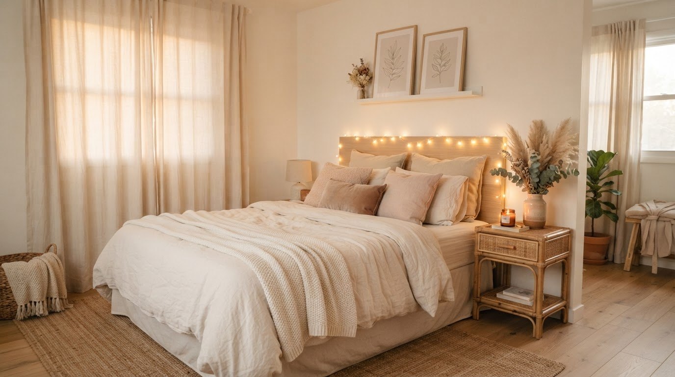
6. Start With Pink Linen Bedding
If you only change one thing in a bedroom, make it the bedding. Washed linen in blush or dusty rose looks relaxed and expensive at the same time, because the slightly rumpled texture keeps it from looking sweet. Look for pink linen bedding in a soft washed finish and pair it with white or cream sheets underneath so the pink reads as a layer, not a block. For more ideas on making a bed feel inviting, my bedroom ideas that feel like a hug are a nice next read.
7. Layer Velvet Throw Pillows
Velvet makes pink look rich. Two or three blush velvet throw pillows on a cream or gray sofa instantly shift the mood. Use the formula two plain velvet plus one textured (boucle, knit or linen) so the arrangement has depth. Odd numbers usually look more relaxed than perfect pairs.
8. Ground the Room With a Pink Rug
A rug is a big swath of color you can take with you when you move. A soft pink area rug in a faded or vintage-style pattern looks more grown-up than a solid bright one, and a washable version is a relief if you have pets or a habit of eating on the sofa. Size up: in a living room the front legs of the sofa and chairs should sit on it.
9. Hang Sheer Pink or Cream Curtains
Pale pink sheers make daylight rosy. If that feels like a lot, go with cream sheers and a pink tieback or a narrow pink border. Hang the rod close to the ceiling and let the fabric just kiss the floor; it makes the room look taller.
10. Add a Knit Throw in a Deeper Rose
One deeper shade adds contrast and stops the room from looking washed out. A chunky knit in rose or mauve draped over a chair arm or folded at the foot of the bed does that quietly.
11. Mix Patterns in the Same Color Family
A gingham cushion, a striped pillowcase and a tiny floral throw can all live together if they share a pink. Keep one pattern large, one medium and one small. That rule alone makes pattern mixing look styled rather than random.
Furniture and Accents
You don't need a pink sofa (though you can absolutely have one). A few well-chosen pieces carry more personality than a full set.
12. Choose One Statement Piece in Pink
A velvet accent chair, a pink upholstered headboard or a rose-colored ottoman becomes the focus of the room. Keep everything around it calm so it gets to be the star. One statement piece per room is the grown-up limit.
13. Bring In Warm Wood
White oak, walnut or rattan stop pink from looking too sugary. A wooden side table, a cane bench or a simple oak shelf is the "one grown-up material" from the rules card in action.
14. Add Gold, Brass or Champagne Accents
A small amount of metal adds warmth and polish. Think a brass picture frame, gold drawer pulls or a tray with a thin gold edge. A gold-framed arched accent mirror is a lovely pick for a hallway or above a dresser; a slim frame keeps it elegant rather than ornate. Keep metals to one finish so the room looks pulled together.
15. Use Ceramics and Stone for Weight
A marble tray, a travertine candle holder or a chunky cream ceramic vase gives pink something solid to lean against. Hard, cool materials make soft colors look more intentional.
16. Paint or Swap One Small Piece
A thrifted nightstand painted in blush, or a dresser with new pink ceramic knobs, gives you color with almost no money spent. My budget apartment decor ideas have more swaps like this that look far pricier than they are.
Lighting That Flatters Pink
Lighting changes pink more than any other color. The same blush can look peachy, gray or rosy depending on the bulb.
17. Pick Warm White Bulbs
Look for bulbs labeled 2700K (warm white). Cooler bulbs make pink look cold and slightly gray; warmer ones bring out the rosy undertone. If the room feels flat in the evening, a bulb change is the first thing to try.
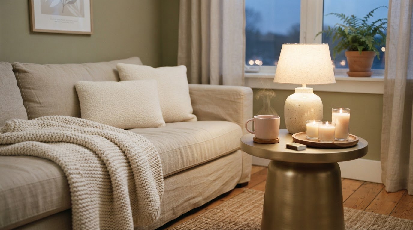
18. Add a Pastel Table Lamp
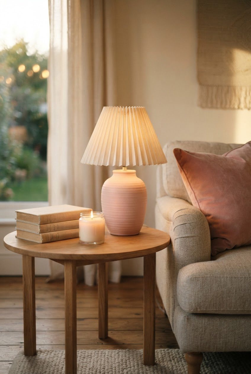
A ceramic lamp base in pink with a linen or pleated cream shade is pretty even when it's switched off. A pastel ceramic table lamp on a nightstand or side table adds color at eye level, which is where people actually notice it.
19. Layer Three Light Sources
Ceiling light, a lamp and something low (a candle, a small accent light, a string of warm lights inside a jar). Three light points at different heights make any room look softer and more finished after dark. My guide on styling candles at home has easy groupings for the low layer.
20. Try a Pink Lampshade
A blush fabric shade turns the light itself faintly pink. It's a tiny, cheap change with a big mood payoff, and it makes evenings feel gentle without adding a single extra object.
Styling Details
This is where the room starts to look like you. Small things, chosen slowly.
21. Add Faux or Fresh Florals
Peonies and garden roses are made for pink rooms. Fresh flowers are a lovely weekly treat, but a few good faux pink peony stems in a simple glass or ceramic vase last all year. Choose stems with slightly uneven petals and a soft matte finish; those read as real from a few feet away.
22. Style a Small Vignette
Group three objects of different heights on a tray: a vase, a candle and a small stack of books. Pink, cream and one metal accent is the formula. If you love collecting little things, my trinket shelf ideas show how to display them without clutter.
23. Use Books as Color Blocks
Turn a few books with pink or cream spines face out, or stack them by color on a shelf. It's free, it adds height to vignettes and it makes the room feel lived in.
24. Bring In Something Green
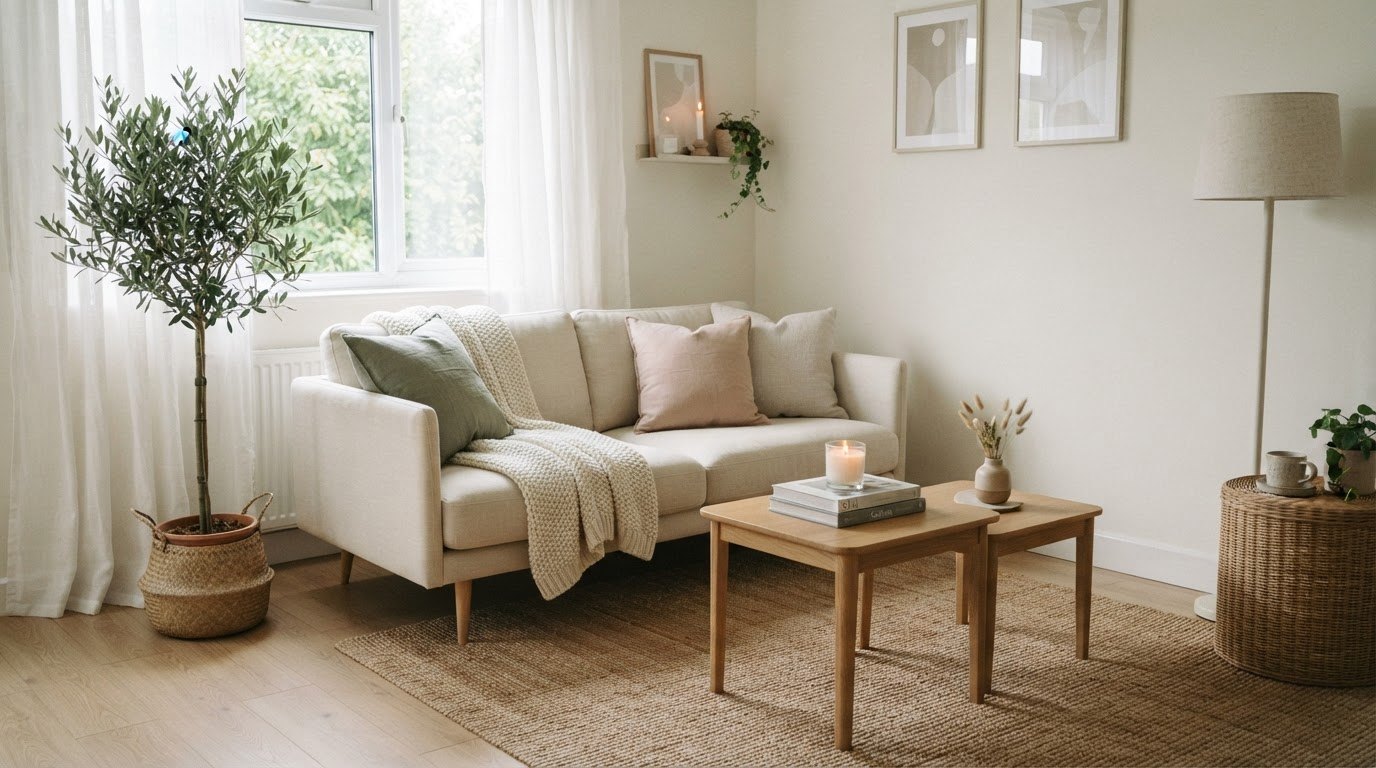
Plants are pink's best friend. A trailing pothos, a small olive tree or even a few eucalyptus stems add the sage note from the palette table and make the room look fresh rather than frosted.
25. Edit Before You Add
Before buying one more pink thing, take three things away. Pink rooms look best with breathing space around each piece. If you're not sure what to remove, start with anything plastic, anything with text and anything that duplicates something else.
Pink Room Ideas by Room
The same rules apply everywhere, but each room has a sweet spot:
- Bedroom: blush and cream pairing, pink linen bedding, warm lamps on both sides. The calmest place to go all in.
- Living room: dusty pink and gray or rose and sage, pink kept to cushions, a rug and one chair. Neutral sofa for longevity.
- Home office: dusty pink with charcoal, a pink desk chair or lamp, wood desk. Focused but still soft.
- Bathroom: pink towels, a rose bath mat and one plant. Easy to change seasonally.
- Entryway: pink and gold, a slim console, a vase of flowers. The first thing you see when you come home.
For the bigger picture of pulling a room together around a mood, my aesthetic room decor ideas are a good companion to this list.
How To Choose the Right Shade of Pink
Not all pinks behave the same way, and the light in your room matters more than the swatch in your hand. A few quick checks save a lot of returns:
- Check the undertone. Hold the item next to a sheet of white printer paper. Pinks that lean peach or beige feel warm and relaxed; pinks that lean lilac or gray feel cooler and more modern. Pick one direction and keep the whole room in it.
- Look at it in your room, at three times of day. Morning, late afternoon and evening with the lamps on. A blush that looks perfect at noon can turn salmon under a warm bulb at night.
- Consider the window. North-facing rooms get cooler light, so warmer pinks (with a hint of peach or beige) stop them from feeling gray. South-facing rooms can handle cooler, dustier pinks without going flat.
- Go muted for big pieces. The larger the item (wall, rug, sofa), the more muted the pink should be. Save brighter, clearer pinks for small things like a vase or a single cushion.
A small honest admission: I once fell for a pink that looked delicate on the swatch and practically glowed bubblegum on the wall. Now I always test big pinks in the actual room first, and I'd gently suggest you do the same.
Common Pink Decor Mistakes
- Matching everything perfectly. A slight shade variation looks curated. Identical pinks look like a catalog bundle.
- Choosing paint from a tiny chip. Pink intensifies on a full wall. Pick the shade one step lighter than the one you love on the chip.
- Forgetting the floor. A pale room needs something darker below eye level, like a wood floor, a patterned rug or a dark-legged chair.
- Buying everything at once. Add one piece a week and live with it. You'll make better choices, and the room will look collected over time.
Final Thoughts
Pink doesn't have to be loud, sweet or temporary. Paired with a calm base, a little wood or brass and plenty of texture, it becomes one of the most restful colors you can live with.
Pick one row from the palette table, start with a single change (bedding, a lamp or a rug) and let the room grow from there. A soft space that feels like you is worth taking slowly.