Most paint regret has nothing to do with taste. The color you loved on the tiny chip was probably lovely; it just had an undertone you couldn't see yet, and your room's light pulled it out. That soft greige turns purple, the warm white looks like old butter, the dreamy blue goes cold and gray by evening.
The good news is that undertones and light follow predictable rules. Once you know what's hiding inside a color and which way your windows face, choosing paint stops being a gamble and becomes a calm, logical little process.
This guide covers exactly how to choose paint colors without regret: undertones made simple (including the pink, green and yellow hiding in whites and beiges), how north, south, east and west light changes everything, a five-step sample test, which finish to use in each room, how to build a whole-home palette, and what to do with ceilings and trim. I'll keep it brand-free, because the method works with any paint you choose.
Why Paint Looks Different on Your Wall
A paint chip is a tiny square under bright store lighting. Your wall is a huge surface under your specific light, next to your floors, furniture and the colors bouncing off them. Three things change how a color reads:
- Size. Color intensifies over a large area. A gentle chip often looks about one shade darker and more saturated on a full wall.
- Light. Natural light changes direction, warmth and strength through the day, and bulbs add their own warmth or coolness at night.
- Surroundings. A green lawn outside the window, a honey-toned wood floor or a red rug can all reflect onto your walls and shift the color.
That's why choosing from a chip alone almost always disappoints. The rest of this guide is about working with these three things instead of being surprised by them.
Undertones Made Easy
Every color has a main color you see first (its "mass tone") and a quieter color underneath, the undertone. The undertone is what shows up in certain light and makes you say "why does my beige look pink?"
Warm, Cool and Neutral
At the simplest level, undertones are warm (yellow, red, orange, pink), cool (blue, green, violet) or close to neutral (balanced, with very little pull either way). Warm colors feel inviting and soft; cool colors feel fresh and calm; true neutrals feel quiet and flexible. None is better. What matters is choosing an undertone that works with your light and the things you're keeping in the room.
The Hidden Undertones in Whites
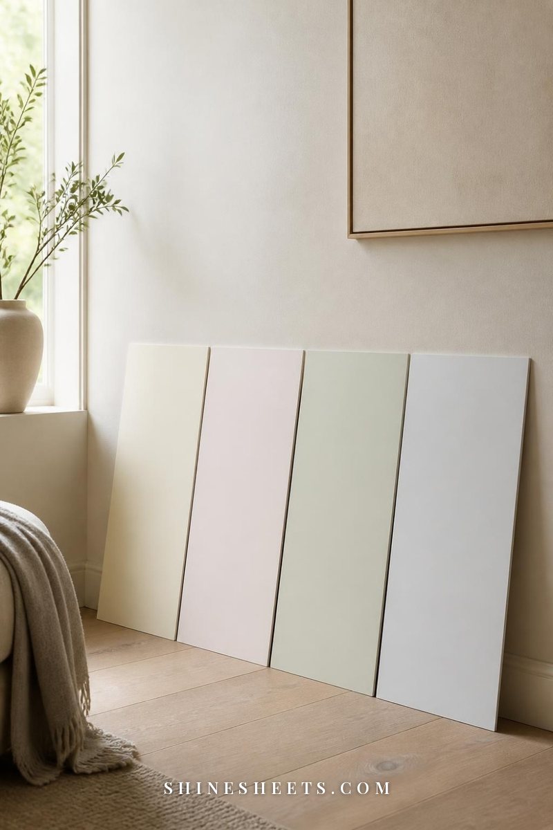
White is the color people find hardest to choose, because there are hundreds of them and they all look like "white" on the chip. Here's what's usually hiding inside:
- Yellow undertone: creamy, warm and soft. Lovely in cool, north-facing rooms, but can look buttery or dingy in already warm, sunny rooms.
- Pink or red undertone: soft, flattering and slightly romantic. Can read as blush in warm light.
- Green undertone: fresh and natural, especially with plants and wood. Can look slightly sour next to warm beige furniture.
- Blue or gray undertone: crisp, clean, gallery-like. Beautiful in bright south light, but can feel cold and flat in a north-facing room.
- Balanced, near-neutral: the safest whites for trim and whole-home use. Look for whites described as "soft" or "clean" rather than "bright" or "creamy."
The Hidden Undertones in Beiges and Greiges
Beige and greige (gray plus beige) are wonderful, calm foundations for neutral home decor, but they are also the biggest undertone tricksters:
- Pink beige: warm and soft, but can look peachy or fleshy in warm light.
- Green beige: earthy and natural. Next to warm wood, it can turn slightly olive.
- Yellow beige: sunny and traditional, but can look dated in strong light.
- Violet greige: the infamous "my gray looks purple" color, especially in cool north light.
- Green greige: very livable and modern; it usually looks calm and grounded.
If you're after a soft blush wall, the same rules apply: pinks with a touch of beige or gray in them look grown-up and calm, while pinks with a blue undertone lean cooler and brighter. My pink room decor guide has ideas for pairing them with the rest of the room.
How To Spot an Undertone
Undertones become visible when you compare. Try these three tricks:
- The white paper test. Hold your chip against a plain sheet of bright white printer paper. Next to pure white, the undertone jumps out.
- The family test. Compare chips side by side with similar colors. A beige next to three other beiges will suddenly look clearly pink, green or yellow.
- The darkest-chip test. On a paint strip, look at the deepest color at the bottom. It shows the undertone much more clearly than the pale top shade.
How Light Direction Changes Color
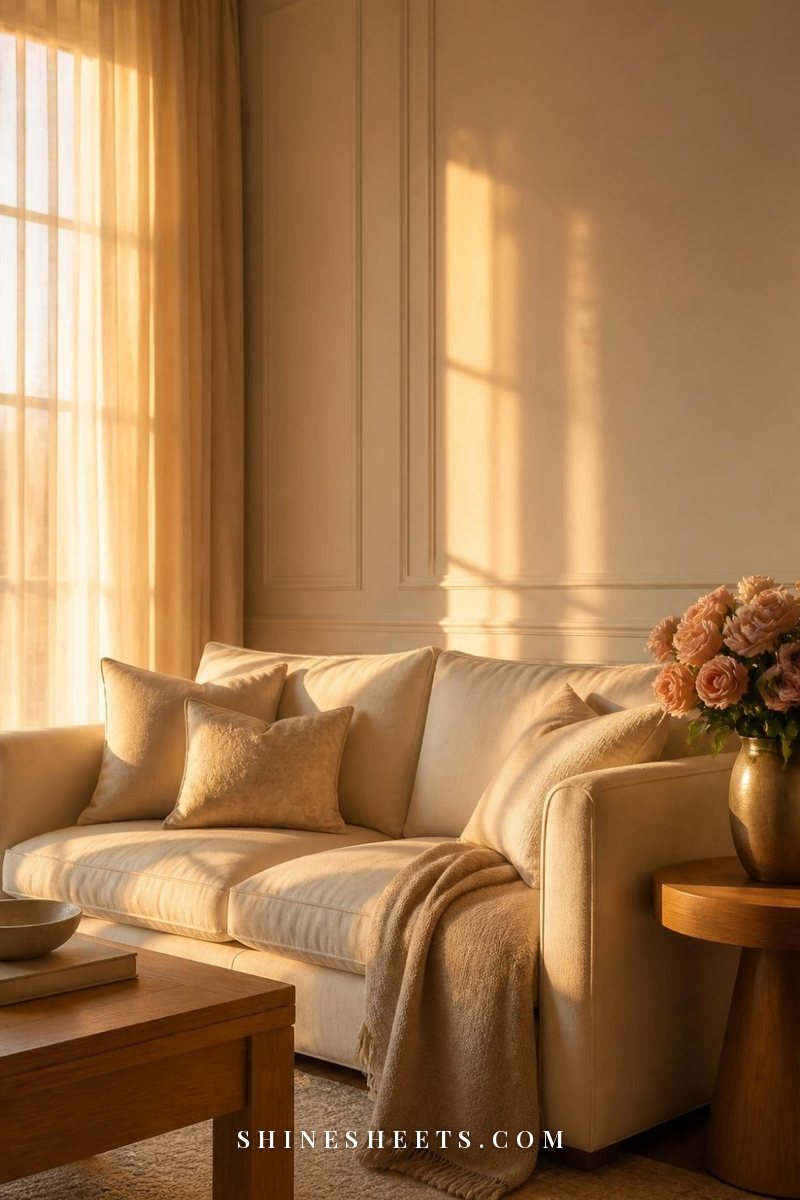
Light is the other half of every paint decision. Before choosing anything, stand in the room and figure out which direction the main window faces (a compass app makes this quick). Then use this as your starting point:
- North-facing rooms (northern hemisphere) get cool, indirect, bluish light all day. Colors look darker and cooler, and gray undertones get stronger.
- South-facing rooms get bright, warm light for most of the day. Colors look lighter and warmer, and strong warm colors can feel intense.
- East-facing rooms are warm and bright in the morning, then cooler and flatter in the afternoon.
- West-facing rooms are cool and soft in the morning, then glowing, golden and warm in late afternoon and evening.
(If you live in the southern hemisphere, swap north and south.)
Room Light and the Undertones That Work
This is the table I'd keep open while choosing. Screenshot it before you head to the paint store.
| Room light | What it does to color | Undertones that work | Be careful with |
|---|---|---|---|
| North-facing | Cools and darkens, mutes colors | Warm whites with a touch of yellow or pink, warm beiges, greiges with a warm base, soft blush, warm greens | Blue-white, cool grays, violet greiges (they can look cold or purple) |
| South-facing | Warms and brightens, intensifies | Cool or balanced whites, soft gray-greens, cool blues, crisp greiges | Very yellow whites and strong oranges (they can look harsh) |
| East-facing | Warm mornings, cool afternoons | Balanced neutrals, warm-leaning whites, sage and soft greens | Very cool grays that look flat after noon |
| West-facing | Cool mornings, golden evenings | Balanced or slightly cool whites, gray-greens, muted blues | Strong warm beiges and pinks that can turn orange at sunset |
| Little natural light (hallways, small bathrooms) | Depends almost entirely on bulbs | Warm, mid-tone colors that feel enveloping rather than trying to look bright | Stark whites that read gray and dull |
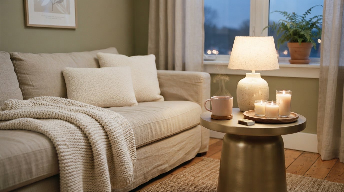
Don't forget artificial light. Warm white bulbs (around 2700K) bring out yellow and pink undertones; cooler bulbs (4000K and up) bring out blue and green. Test your samples under the bulbs you actually use at night.
The 5-Step Sample Test
This is the part that saves you from repainting. It takes about three days, and it's worth every minute.
Step 1: Narrow It Down to Three
Use the table above to choose three candidates with an undertone that suits your light. Three is enough to compare without getting overwhelmed. If you can't choose between ten whites, pick the three that look best next to your trim, floor and biggest piece of furniture.
Step 2: Make Large Swatches
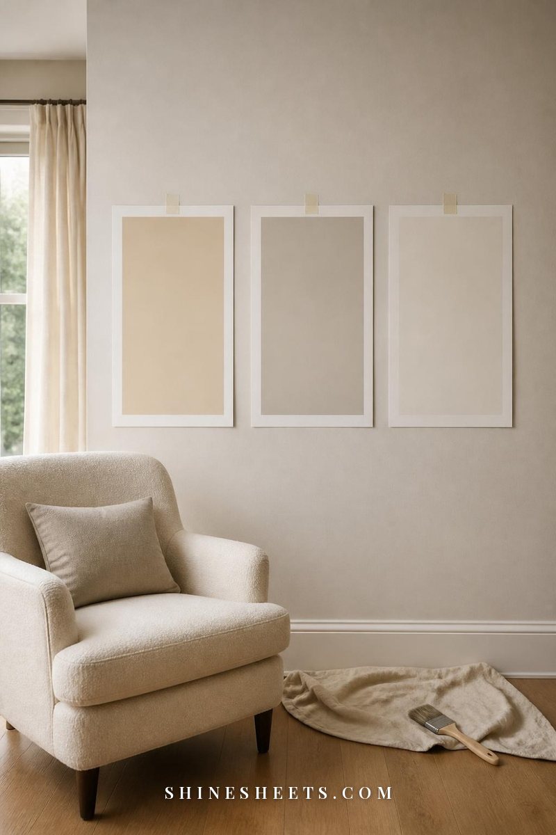
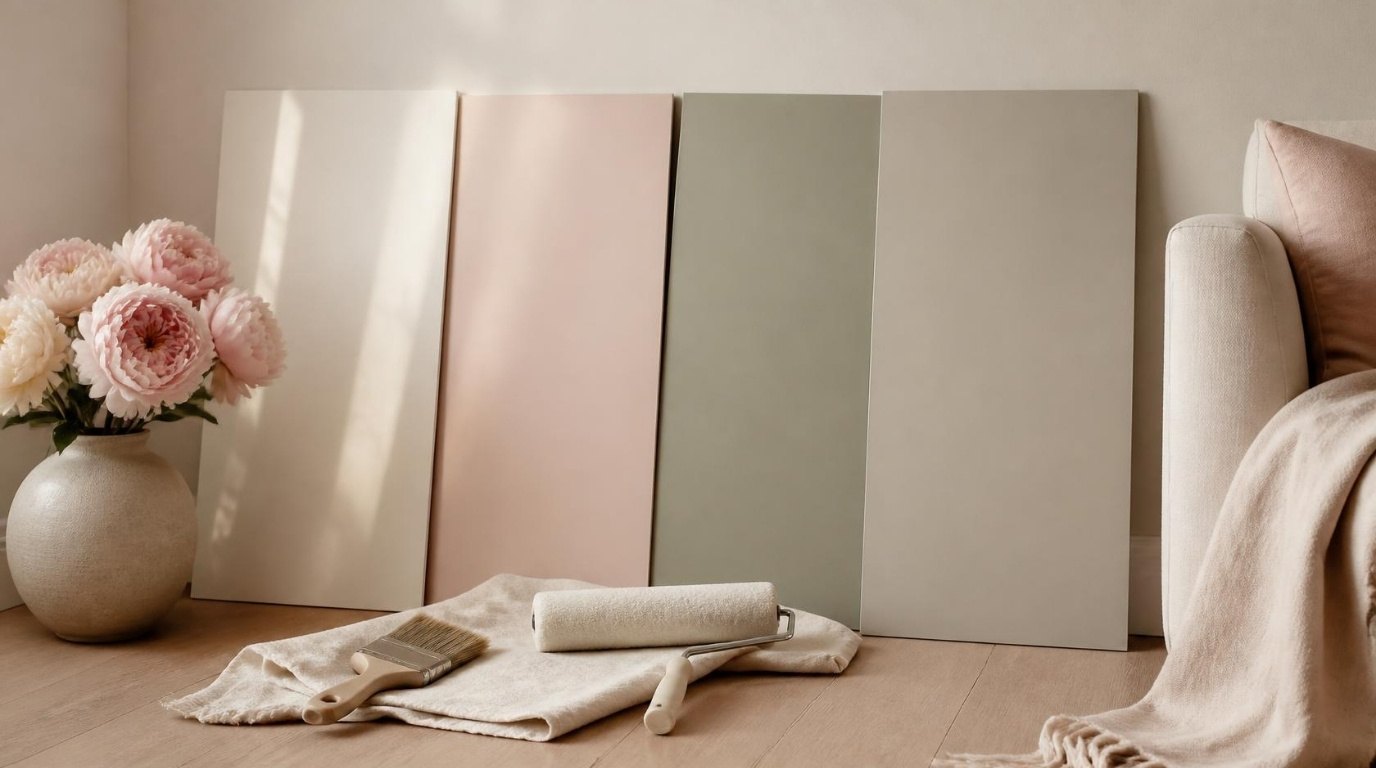
Small brushed squares directly on your old wall lie, because the old color around them changes how you see them. Instead, use peel-and-stick paint samples, or paint two coats onto large pieces of white poster board, at least 12 by 18 inches. Leave a white border around each one so the color isn't influenced by your current wall.
Step 3: Place Them Around the Room
Tape each swatch with delicate-surface painter's tape in three spots: next to the window, on the darkest wall and near the floor or furniture it needs to work with. Move them every day. The same color can look completely different on two walls of the same room.
Step 4: View Them at Three Times of Day
Look at every swatch in the morning, midday and evening with your lamps on. Take a quick photo each time if it helps, but trust your eyes over your camera, because phone cameras adjust color automatically. Notice which one you still like at all three times. Often that's not the one you loved first.
Step 5: Live With It for 48 Hours
Give yourself two full days. The right color usually becomes the one you stop noticing in a good way: it simply feels like the room. The wrong one keeps catching your eye for the wrong reasons. If two colors tie, choose the slightly lighter one, because color always looks a little stronger on a full wall.
Paint Finishes by Room
The finish (how shiny the paint is) changes both the look and how easy it is to clean. In general, the shinier the finish, the more durable and washable it is, and the more it shows wall imperfections.
- Flat or matte: soft, velvety, hides bumps. Best for ceilings, bedrooms and adult living rooms with little wear.
- Eggshell: a whisper of sheen and easier to wipe. The go-to for living rooms, dining rooms, hallways and most bedrooms.
- Satin: a soft glow, very washable. Great for kitchens, bathrooms, entryways and busy hallways.
- Semi-gloss: durable and moisture-resistant. Classic for trim, doors, cabinets and bathrooms with little ventilation.
- High gloss: glassy, dramatic and very hardworking. Use it for statement doors, furniture or lacquered-look cabinets, and only on very smooth surfaces.
For crisp lines around trim and corners, an angled sash brush makes cutting in much easier than a flat brush. For small walls, furniture or touch-ups, a mini paint roller set gives a smooth finish without the mess of a full-size tray.
A gentle safety note: open windows and keep air moving while you paint and for a day or two after, take breaks if you feel lightheaded, and consider low-VOC paints for bedrooms. If your home was built before 1978, older layers may contain lead, so test before sanding or scraping. The EPA's lead guidance explains how to do that safely.
Choosing Colors by the Mood You Want
Once you know which undertones suit your light, the mood you want decides how light or deep to go. A few gentle guidelines:
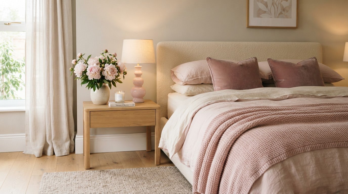
- Calm and restful (bedrooms): soft, slightly muted colors with a gray or beige base, such as dusty blush, pale sage or warm greige. Keep them in the lighter third of the paint strip.
- Bright and fresh (kitchens, bathrooms): clean balanced whites, airy greens or soft blues. A satin finish keeps them easy to wipe, and if you rent, my rental bathroom makeover ideas show how to freshen a space when you can't repaint.
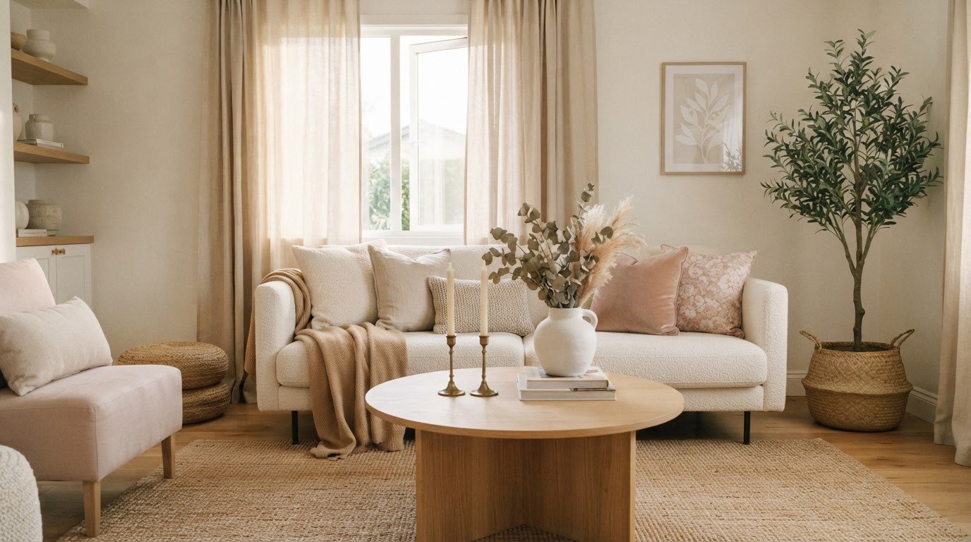
- Warm and welcoming (living rooms, entryways): creamy whites, warm beiges and mushroom tones that look lovely under lamplight.
- Focused and grounded (home offices): muted greens and soft blue-grays tend to feel calm without making you sleepy.
- Intimate and dramatic (dining rooms, powder rooms): this is where deeper muted colors shine, because you mostly use these rooms in the evening, when rich colors look their best.
One small reassurance: there is no "wrong" mood, only a mismatch between the color and how you actually use the room. Think about when you spend time there and what you want to feel, and let that guide how deep you go.
How To Build a Whole-Home Palette
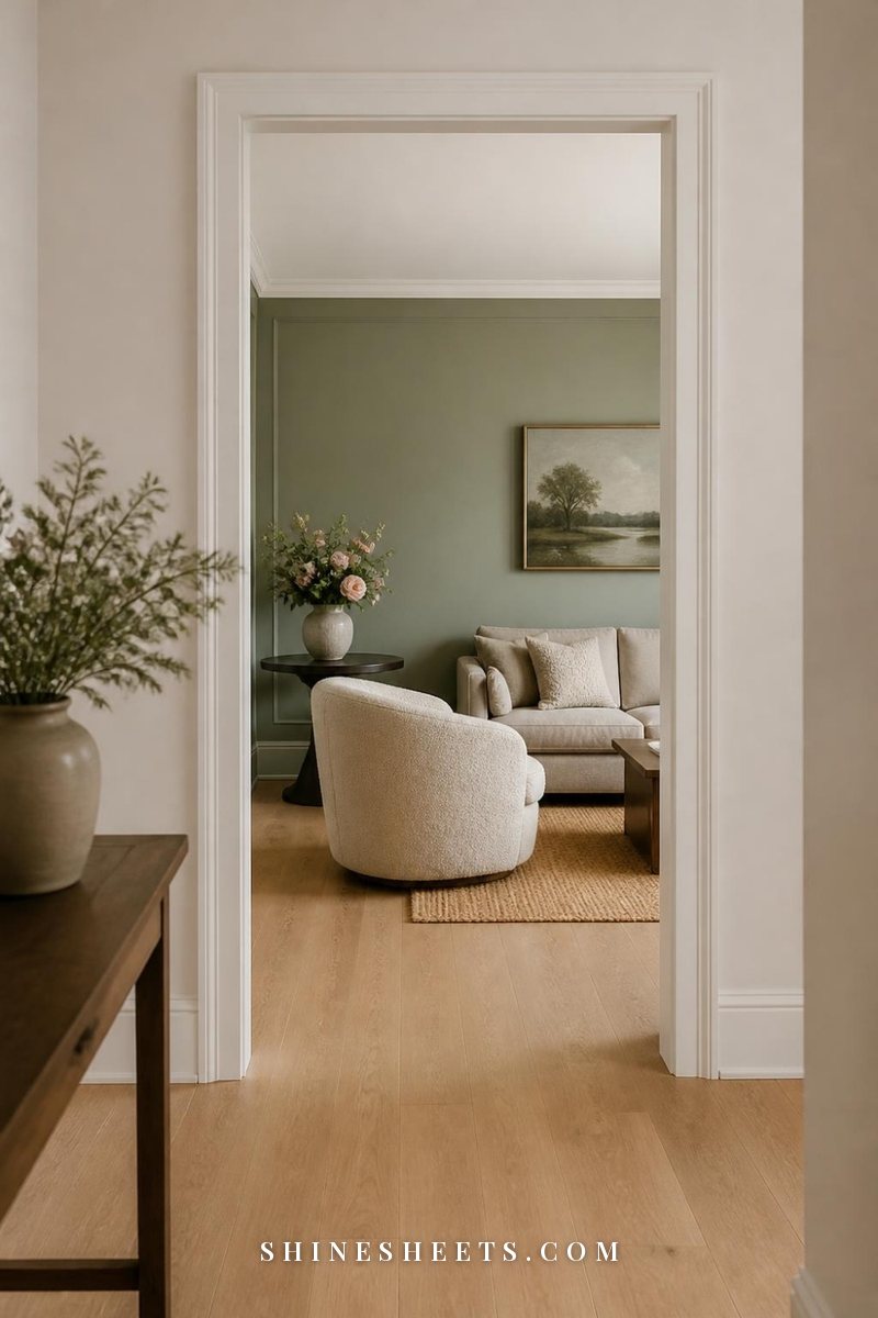
A home feels calm when the colors flow from room to room, especially in open-plan spaces or anywhere you can see two rooms at once. You don't need every room in the same color. You need the colors to feel related.
- Choose one main neutral. This is your "connector" color for hallways, open areas and the walls that link rooms.
- Keep one undertone family. If your main neutral is warm, keep most other colors warm-leaning. Mixing a cool blue-gray with a yellow beige in sight of each other is what makes homes feel disjointed.
- Add two or three accent colors. A soft sage for a bedroom, a dusty blush for an office, a deeper muted blue for a dining room. Choose them in similar levels of softness so they look like a family.
- Use the same white everywhere for trim. One consistent trim color ties even very different rooms together.
- Repeat colors in small doses. A pillow, vase or rug that echoes the bedroom color in the living room makes the whole home feel intentional.
A simple trick: lay your chosen chips in a row in the order you walk through your home. If one jumps out as "not like the others," it probably is. A basic color wheel is handy here, too, for checking which accent colors sit comfortably next to your main neutral.
In small spaces, softer, lighter colors with the right undertone make walls feel like they step back. If that's your situation, my ideas for a small living room pair nicely with this palette approach.
Ceilings and Trim
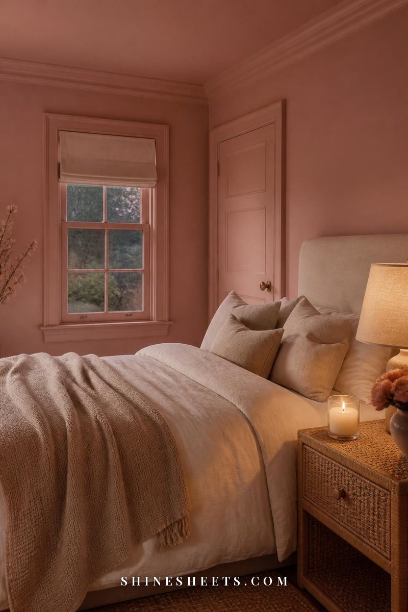
Ceilings and trim are where a room goes from "painted" to "finished."
- Ceilings: flat finish, always. A white with the same undertone as your walls looks seamless. For a softer, more enveloping room, try your wall color lightened by about half, or the same color on walls and ceiling for a modern cocooning look.
- Trim: semi-gloss or satin. Match its undertone to your walls: a warm white trim next to warm walls, a clean balanced white next to cool walls. A stark blue-white trim next to a creamy wall makes the wall look dirty.
- Color-drenching: painting walls, trim and even the ceiling in one color (in different finishes) is a beautiful way to make a small room feel calm and designed.
- Doors: interior doors can match the trim, or go one shade deeper than the walls for a quiet, tailored look.
Common Paint Color Mistakes
- Choosing from a tiny chip. Always sample large.
- Choosing before you choose everything else. Pick paint after rugs, sofas and fabrics. There are thousands of paint colors and only a few sofas you'll love.
- Ignoring the floor. Orange-toned wood, cool gray tile and warm beige carpet all change how your walls look.
- Going too bright. Pure, saturated colors almost always look stronger on a wall. Look for slightly muted versions.
- Testing only in daylight. Most of us spend our evenings at home, so your color has to look lovely under lamps too.
- Following a trend that doesn't suit your light. The beautiful color in a sun-filled photo might be gloomy in your north-facing bedroom. Choose for your room, not the photo. For more on creating a look that feels personal, my guide to aesthetic room decor can help.
Final Thoughts
Choosing paint colors gets so much easier once you stop looking for the perfect color and start looking for the right undertone for your light. Check which way your windows face, narrow it down to three, sample them large and give yourself two days to live with them.
Your walls are the backdrop for everything you love in your home. A little patience at the sample stage means you'll get to enjoy that calm, just-right feeling every single time you walk into the room.