The colors that suit you aren't a mystery only stylists can solve. They come down to two simple things you can check at home in ten minutes: your undertone and your contrast level. Once you know those, shopping gets faster, outfits start matching on their own and that one top you never wear finally makes sense.
A personal palette also isn't a rulebook. It's more like a shortlist of colors that make your skin look rested and your eyes look brighter, plus a few neutrals that hold everything together. You can still wear anything you love. You'll just know which pieces work hardest near your face and which ones are better as trousers, bags or shoes.
This guide walks you through how to find your color palette step by step: three easy undertone tests, a quick contrast check, a palette table by undertone and a simple formula (3 neutrals + 2 main colors + 1–2 accents) you can use to build a wardrobe that works together. No jargon, no expensive consultation, just good light and a little curiosity.
Why a Personal Color Palette Makes Getting Dressed Easier
Most "I have nothing to wear" mornings aren't really about not having enough clothes. They're about clothes that don't talk to each other. A coral top bought on sale, a mustard cardigan from a trend season, a cool gray coat that makes everything look a little flat. Each piece was fine on its own, but together they don't make outfits.
A color palette fixes that in three ways:
- Everything mixes. When your neutrals and colors are chosen to work together, nearly every top goes with nearly every bottom.
- You look more awake. The right shade near your face softens shadows and evens out redness. The wrong one can make you look tired even after a full night's sleep.
- You buy less (and better). When you walk into a store with a palette in mind, you skip half the racks. That saves money and decision energy.
If you're working on a capsule wardrobe, your palette is the step that makes it all click. My guide to building a capsule wardrobe step by step pairs beautifully with this one.
Step 1: Find Your Undertone
Your undertone is the subtle color beneath the surface of your skin. It doesn't change with a tan or in winter, unlike your surface tone. There are three main undertones:
- Warm: golden, peachy or yellow hints.
- Cool: pink, rosy or bluish hints.
- Neutral: a balance of both, with no clear lean either way.
Do these tests in natural daylight, near a window, with a clean face (no foundation, no self-tanner). Artificial light, especially warm bulbs, can trick you. Try all three and see which answer shows up most often.
The Vein Test
Look at the veins on the inside of your wrist.
- Mostly green or olive → likely warm.
- Mostly blue or purple → likely cool.
- A mix, or hard to tell → likely neutral.
This test is the most famous, but it's also the least reliable on its own, especially for deeper skin tones where veins are harder to see. Treat it as one clue, not a verdict.
The Jewelry Test
Hold a gold piece and a silver piece against your wrist or near your face, one at a time. Notice which one makes your skin look clearer and more even.
- Gold looks better → warm.
- Silver looks better → cool.
- Both look lovely → neutral (lucky you, you can mix metals freely).
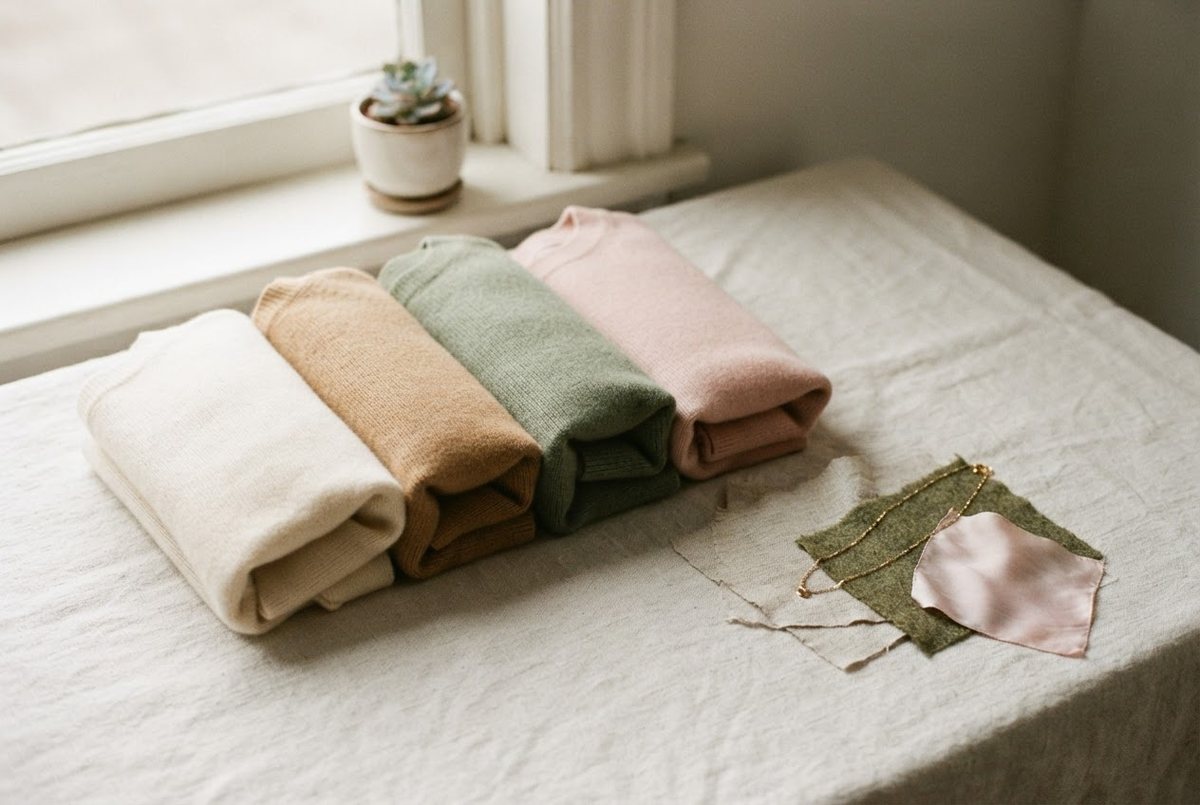
If you don't own both, a simple gold chain necklace and a delicate silver pendant are worth having anyway. They're the kind of pieces you'll wear for years once you know which metal is yours.
The White vs Cream Test
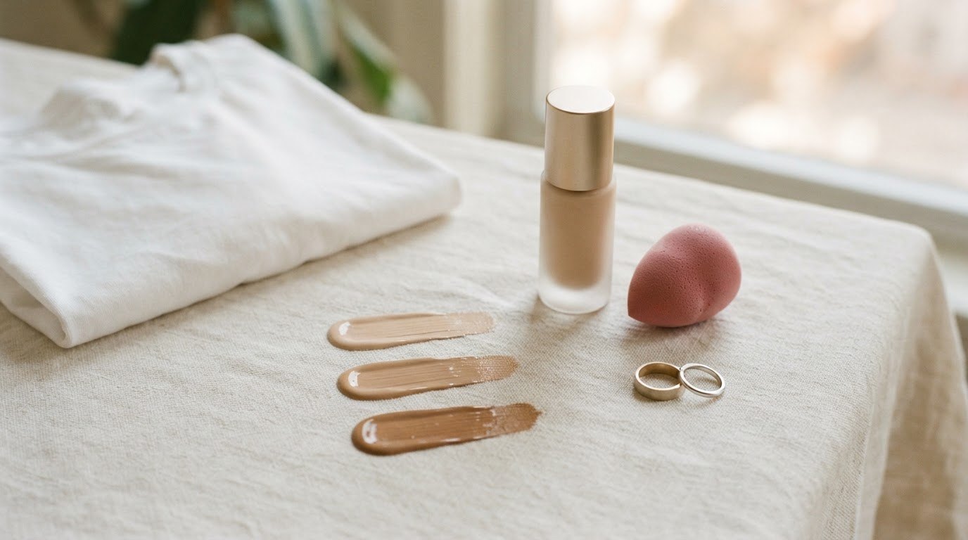
This is my favorite test because it's the most visual. Grab a pure, bright white T-shirt or sheet and a cream or ivory one. Hold each under your chin in daylight and look at your face, not the fabric.
- Pure white makes you look fresh and bright, cream makes you look a bit sallow → cool.
- Cream makes you look warm and healthy, pure white looks harsh or makes you look pale → warm.
- Both look fine → neutral.
Pay attention to the area under your eyes and around your mouth. The wrong shade tends to deepen shadows and highlight redness there. The right one makes everything look smoother, almost like a soft filter.
What If Your Results Don't Match?
Mixed results are very common and usually mean one of two things: you're neutral, or you're a "neutral-warm" or "neutral-cool" that leans slightly one way. In that case, go with the answer from the white vs cream test, since it's closest to how clothing actually behaves next to your face.
If you've ever matched a foundation shade, you've already done a version of this work. My guide on how to choose your foundation shade uses the same undertone logic, so you can cross-check your answer there.
Step 2: Figure Out Your Contrast Level
Undertone tells you which colors suit you. Contrast tells you how to combine them. Contrast is the difference between your hair, skin and eyes. Take a photo of your face in daylight, switch it to black and white, and look.
- Low contrast: hair, skin and eyes look similar in lightness (for example light blonde hair, fair skin, light eyes, or deep brown hair, deep skin and dark eyes). Soft, blended outfits suit you best: cream with camel, sage with stone, tone-on-tone looks.
- Medium contrast: some difference, but nothing dramatic (for example medium brown hair, light-to-medium skin). You can do moderate pairings like navy with cream or olive with ivory.
- High contrast: a strong difference (for example dark hair with fair skin, or very light eyes with dark hair). Crisp combinations look striking on you: black and white, navy and bright white, a bold color against a pale neutral.
Here's a small, honest admission: for a long time I thought certain colors simply "didn't suit me," when really I was wearing them in combinations that were too stark for my coloring. Same colors, softer pairing, completely different result.
The Palette Table by Undertone
Use this table as your starting point. Find your undertone row, then pick the shades within it that you already love. You don't need all of them; you need a handful that feel like you.
| Undertone | Best neutrals | Best colors | Metals | Wear away from the face |
|---|---|---|---|---|
| Warm | Cream, ivory, camel, chocolate brown, warm beige, olive | Rust, terracotta, mustard, warm coral, moss green, teal, tomato red | Gold, brass, rose gold | Icy pastels, pure black, stark white, cool gray, fuchsia |
| Cool | Pure white, soft gray, charcoal, navy, black, taupe | Emerald, sapphire, raspberry, lavender, dusty rose, berry, true red | Silver, white gold, platinum | Orange, mustard, camel, warm khaki, golden yellow |
| Neutral | Off-white, soft navy, stone, greige, mid gray, soft camel | Jade, soft teal, blush, dusty blue, muted red, sage | Gold and silver (mixing works) | Very neon or very saturated shades that overwhelm you |
"Wear away from the face" doesn't mean "never wear." A camel coat on a cool-toned woman can look wonderful with a white scarf at the neckline. Rust trousers on a cool undertone are fine, because your face never sits right next to them. The trick is simply what touches your collarbones.
Step 3: Build Your Wardrobe Palette With a Simple Formula
Now for the fun part. Instead of trying to wear every flattering color, you'll pick a small, focused set. This is what makes a wardrobe feel pulled together.
The Palette Formula Card
Screenshot this and keep it on your phone for shopping trips:
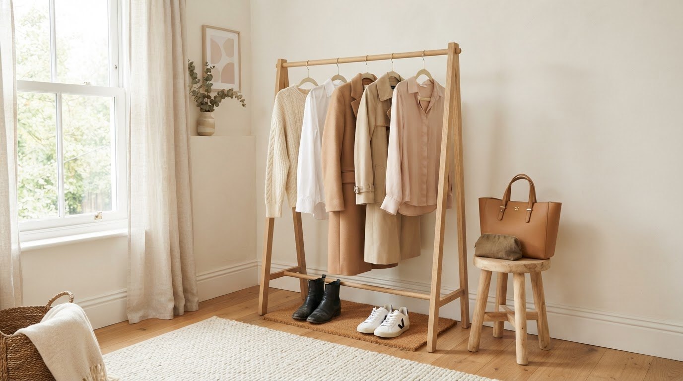
- 3 neutrals → the backbone (60–70% of your wardrobe). One light, one mid, one dark. Example: cream, camel, chocolate.
- 2 main colors → the personality (20–30%). Shades from your undertone row that you genuinely love wearing. Example: sage and dusty blue.
- 1–2 accents → the sparkle (5–10%). Used in scarves, bags, lipstick, one statement top. Example: terracotta.
- 1 metal → gold, silver or both if you're neutral.
The check: every main color should look good with at least two of your neutrals, and your accent should work with at least one main color. If something only pairs with one item, it's an orphan.
Three Example Palettes
- Warm, low contrast: cream, camel, warm brown + olive and soft rust + a touch of mustard. Gold jewelry.
- Cool, high contrast: bright white, charcoal, navy + emerald and raspberry + a pop of true red. Silver jewelry.
- Neutral, medium contrast: off-white, stone, soft navy + sage and blush + a little jade. Mixed metals.
Notice that none of these are loud. Most well-dressed women you admire probably wear a palette like this without even naming it. It's also the secret behind that quiet, expensive look I talk about in how to dress classy on a budget: fewer colors, chosen on purpose.
How To Choose Your Three Neutrals
Neutrals do most of the work, so they deserve the most thought. Here's how to pick them:
- Your light neutral sits closest to your face most often (shirts, tees, knitwear). Choose between pure white, off-white, ivory and cream based on your white vs cream test.
- Your mid neutral is for coats, trousers and bags. Camel, beige and stone suit warm and neutral undertones; soft gray and taupe suit cool ones.
- Your dark neutral replaces black if black feels harsh on you. Chocolate brown, navy, charcoal and deep olive are all gentle alternatives.
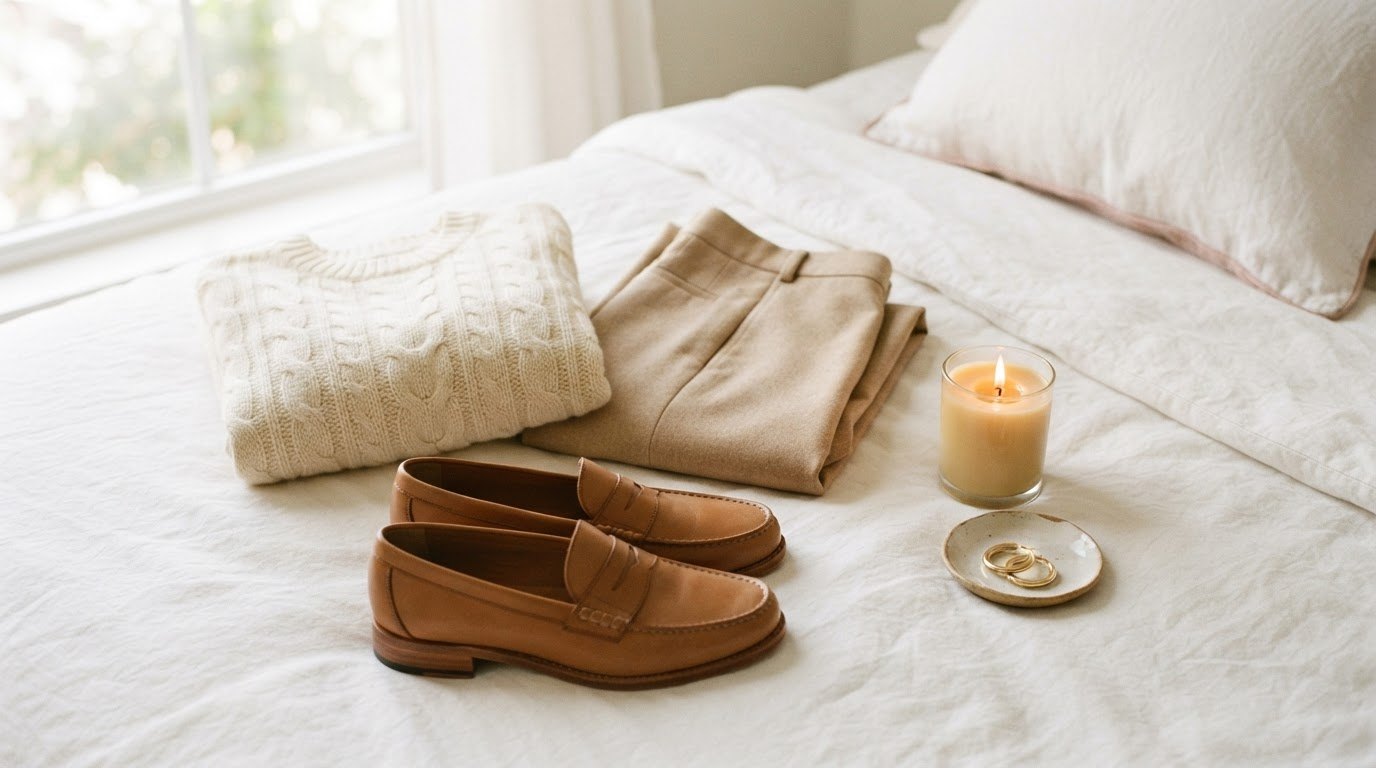
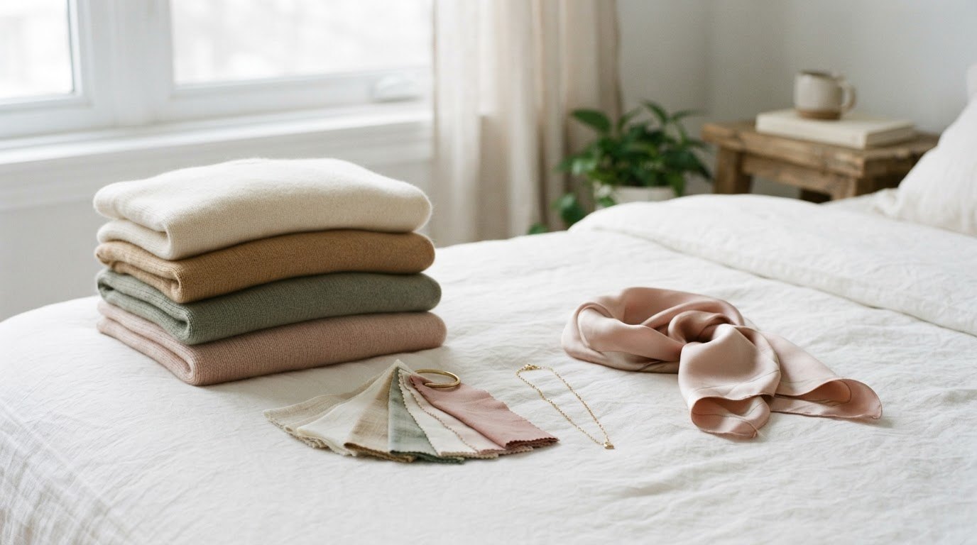
A good first piece is a soft knit in your light neutral. A cream cashmere-feel crewneck sweater (or an ivory or soft white one, depending on your test) will go with nearly everything else you own. Look for a relaxed fit, a fine knit that doesn't pill quickly and a neckline that sits close to your collarbone, since that's exactly where color does its magic.
How To Test Colors at Home Before You Buy
You don't need to buy a shirt in every color to know what works. Here are a few simple ways to test:
- Raid your closet first. Pull out every top and hold each one under your chin in daylight. Make two piles: "my face lights up" and "I look tired." You'll probably see a pattern within ten minutes.
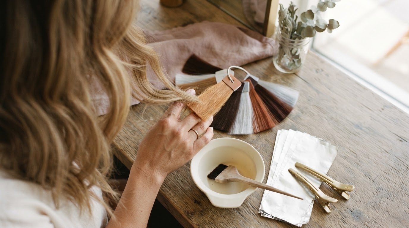
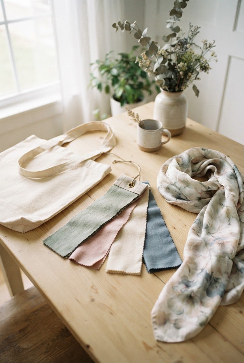
- Use a fabric swatch book. A color fabric swatch book lets you hold dozens of shades up to your face without leaving home. It's an easy way to discover that you look great in a color you'd never have tried in a store.
- Take photos. Same window, same time of day, no makeup, one photo per color. Compare them side by side the next day with fresh eyes.
- Ask one honest friend. Not a group chat. One person who will tell you kindly that the mustard isn't it.
Write your results in your notes app as you go. In a week, you'll have a clear list of "yes" shades, a "maybe" list and a short "only for trousers" list.
Bring Your Palette Into Accessories First
If a full wardrobe refresh feels like too much (it usually does), start with accessories. They're cheaper, they sit close to your face and they let you test a color before you commit to a coat in it.
- Scarves: a blush silk square scarf (or one in your main color) can turn a "wrong" top into a right one. Tie it at the neck and the scarf becomes the color your face sees.
- Bags: a neutral bag in your mid neutral works with every outfit. A cream canvas tote is a lovely everyday choice for warm and neutral undertones; cool undertones may prefer soft gray or white.
- Jewelry: your metal ties everything together. Earrings matter most, since they frame your face.
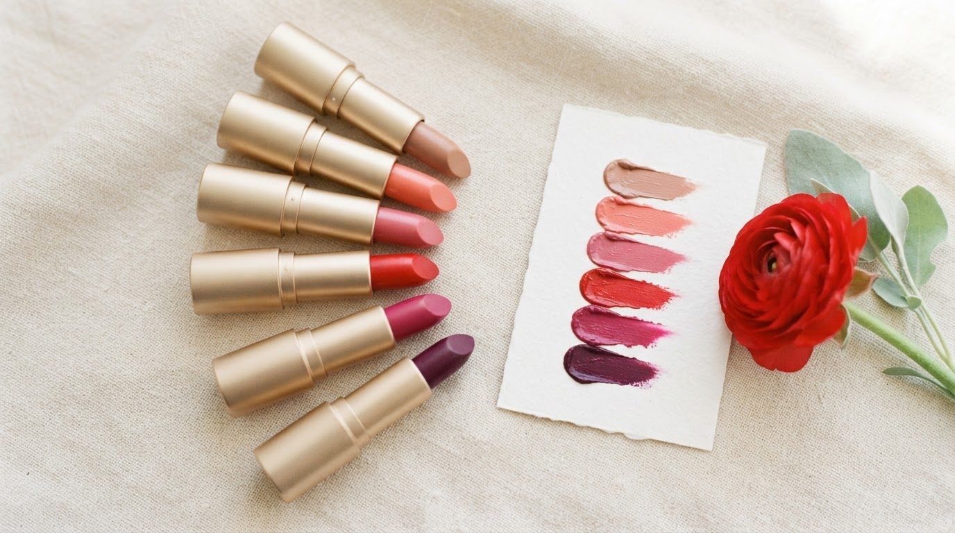
- Lipstick and blush: choose them in your undertone family too. Warm undertones tend to love peach and brick; cool undertones look lovely in rose and berry.
How To Shop With Your Palette
A palette only helps if you actually use it in stores. These habits make it automatic:
- Keep your palette on your phone. Screenshot your formula card and a few color swatches into one album.
- Check the light. Store lighting is often warm or harsh. Walk to a window or the entrance before buying anything that will sit near your face.
- Ask the "three outfits" question. Can you make three outfits with this piece using what you already own? If not, put it back.
- Allow one exception per season. A color outside your palette that you simply love is fine. One, not five.
- Buy neutrals in quality, colors in moderation. Your neutrals will be worn constantly, so they're where better fabrics pay off.
Seasonal shopping is where palettes really shine. In colder months, a warm palette might lean into chocolate, camel and rust, while a cool palette leans into charcoal, navy and berry. My winter outfit ideas are full of combinations you can adapt to your own shades.
A Quick Word on Seasonal Color Analysis
You might have heard of seasonal color analysis, the system that sorts people into seasons and sub-seasons. It can be a fun, detailed option if you enjoy that kind of deep dive or want a professional draping session. But you don't need it to dress well. Undertone plus contrast gets you about 90% of the way there, and it's much easier to remember when you're standing in a fitting room.
Common Color Mistakes (and Easy Fixes)
- Choosing colors from trends instead of your face. Fix: before buying a trend color, hold it under your chin. If it doesn't pass, wear the trend in a bag or shoes instead.
- Too many "main" colors. Fix: limit yourself to two for one season. Notice how much easier outfits become.
- Wearing black because it's "safe." Fix: if black makes you look tired, try navy, charcoal or chocolate as your dark neutral. They read just as polished.
- Judging colors under bathroom lighting. Fix: daylight only, ideally mid-morning.
- Throwing out everything at once. Fix: keep the off-palette pieces you love, pair them with a scarf or necklace in your shade and let the rest go slowly as things wear out.
What If You Love a Color That Doesn't Love You Back?
It happens to everyone. Maybe you adore mustard and you're cool-toned, or you've always wanted to wear icy lavender and you're warm. You don't have to give it up. A few gentle workarounds:
- Move it down. Wear the color in trousers, skirts, shoes or a bag, where it never sits next to your face.
- Add a buffer. Put one of your flattering neutrals between the color and your skin: a cream collar under a sweater, a scarf in your shade, a light neutral tee under an open cardigan.
- Find your version. Most colors come in warmer and cooler shades. A cool-toned woman who loves yellow might find that soft lemon works where mustard doesn't. A warm-toned woman who loves pink might prefer peachy pink or salmon over icy baby pink.
- Use makeup as a bridge. A lip color in your undertone family can make a slightly-off top look intentional.
Your palette is a guide that makes life easier, not a list of forbidden things. Joy counts too.
A Two-Week Plan To Put It All Together
- Days 1–2: do the three undertone tests and the black-and-white photo for contrast.
- Days 3–5: sort your closet into "lights me up," "fine below the waist" and "not for me."
- Days 6–7: write your formula card: 3 neutrals, 2 main colors, 1–2 accents, 1 metal.
- Days 8–10: make five outfits from what you own using only your palette. Photograph them.
- Days 11–14: write a short "missing pieces" list (usually one neutral knit, one scarf, one bag) and stop there.
If you love the idea of a slower, more intentional wardrobe after this, the old money outfits guide shows how a tight neutral palette creates that effortless, timeless look.
Final Thoughts
Finding your color palette isn't about squeezing yourself into a category. It's about noticing which shades make you look like the most rested, most comfortable version of yourself and then letting those colors do the heavy lifting.
Start with daylight, a white shirt and a cream one. Write down what you see, choose your three neutrals and two favorite colors, and let your wardrobe grow slowly from there. Getting dressed will feel lighter, and the mirror will feel a lot friendlier too.